

It used to be quite tough to arrange components in CSS, and people were compelled to utilize inconvenient workarounds like floating components with clearfixes, but afterward came flexbox. Flexbox changed CSS designs and is undoubtedly among the essential CSS elements to emerge in the last ten years.
What Is Flexbox?
Flexbox is a CSS layout method that is divided into two primary parts. Flexbox items and the flexbox container is the root component that houses all flexbox components. The flexbox container is the place where users declare all of the flexbox layout’s characteristics, and then they may fine-tune the specific elements.
Let’s check a basic flexbox sample to see how we’d get going. If you have a component with children elements within it, you must change the parent element’s mode parameter to flex to get a flex container. display: flex
If we provide a flex presentation on an element, we automatically make that component the flex container. All of that element’s immediate children elements are then deemed flex elements.
If no additional characteristics are specified, the flex elements will spread out on one row from left to right, using as much area as required. If pieces typically overflow, they will instantly compress to accommodate within the flex container.
Now, since this is the very foundation of flexbox and isn’t particularly beneficial by itself, we’ll discuss how to manage the arrangement of elements within the container.
See Also: 15 Awesome Flexbox CSS Frameworks
Flexbox Layout
Flexbox was the very earliest CSS layout approach to operate in a manner that was not similar to standard CSS. Flexbox is concerned with the main axis as well as a cross-axis rather than block/inline components.
By default, the main axis (displayed in green) crosses the container horizontally, while the cross axis crosses it vertically. This implies that every layout approach that interacts with the main axis would arrange items horizontally, whereas any layout approach that works with the cross axis would arrange components vertically. Let’s start with how we might put pieces along the primary axis.
justify-content
For the purposes of these instances, we’ll presume that the flex items maintain a width of 20%.

flex-start
All elements are placed at the beginning of the main axis, that is, by standard, on the left end of the axis. This is just the standard action of justify-content.

flex-end
All elements are placed at the endpoint of the main axis, that is, by standard, the right end of the axis.

center
All elements are placed in the middle of the main axis. In CSS, this is among the simplest methods to center elements.

space-between
This uniformly distributes the additional space within the container among each element, allowing them to be as far off from each other as feasible while still filling the container to capacity.

space-around
This is identical to space-between, except it additionally introduces space in the container’s exterior and the first and last elements. The distance between the container’s exterior and the first/last component is precisely half the distance between components.
See Also: Best Alternative to Float in CSS – Using Flexbox

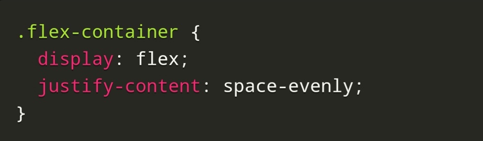
space-evenly
This is identical to space-around, but rather than being half the proportion, the distance between the exterior of the container and the first/last component is the same size as the distance between elements.
You can simply arrange objects across the primary axis to meet your needs with all these features. Let’s look at how to place elements on the cross axis next.
align-items
We’ll consider that the flex-items all possess a width of 20% but that all components have varied heights in all of these instances.

stretch
Unless items possess a specified height defined, this will extend all elements to cover the maximum height of the cross axis. In this instance, You arranged the first child’s height to start, which is as if the first child’s height had not been determined. If a div has no height, the height of the material within it is used instead. However, as one may see beneath, the first child occupies the entire height of the container because it is extending to cover it. On the other hand, the second element does not expand because we gave it a defined height of 100px. This is align-items’ standard behavior.
See Also: Using CSS Flexbox in Responsive Design
