

CSS or Cascading Style Sheet is a language we use to design an HTML document. With CSS, you can add unique styles and develop user interfaces without spending much of your time.
In the recent CSS (CSS3) version, a new technique called Media queries was introduced. Generally, it is used for changing and applying various styles for different media types or devices. However, it has several other features to set the maximum or minimum width of the viewport or your device.
This article will try to explain all the queries related to CSS media, CSS media max and min features, and much more. So, keep reading it till the end.
What is a Media Query in CSS?
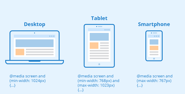
Have you ever noticed changes when you open a website on your desktop and a smartphone? You see a different design of the same website on two other devices, and it is because of the media queries.
In simple words, media queries in CSS are a feature that allows you to modify the look of a website according to some specific constraints or conditions. These constraints are nothing but the system or browser settings of a device. By using media queries, you can create different styles according to the width and height of the viewport or device, its orientation, and resolution.
See Also: 9 Great benefits to using CSS3
The Maximum and Minimum Constraints
The maximum and minimum properties are used to apply a particular style that will work only within your values. You can apply them with either width or height to declare specific values.
Once you pass the maximum property to a media query, the style is applied to the screens whose maximum value is less than what is specified. In this case, CSS automatically assigns the minimum value as 0px.
On the other hand, the minimum property gets applied to screens with greater than the specified value. If a device falls below the minimum range set by you, then the style won’t be applied to it.
See Also: 11 Useful Free CSS Codes for Web Developers
Using Max and Min Media Queries to Change the Width
Let’s assume that we set the min-width(device) to 1024px at 100% width of your website. It means that whenever a device width becomes 1024px or greater, the website will set its width to 100%. If one uses a device having, say, 768px width, the website won’t work at 100% range in this case. Min-width is typically used to design a website for mobile, which usually has a lower width.
@media (min-width: 1024px) {
#Example{width: 100%;
}
}
In another case, let’s set the max-width(device) to 1024px and the width of your website to 70%. In this case, our applied design will work only when a device has a width less than or equal to 1024px. The max-width media queries are used with a desktop-first approach, meaning that the style will first be applied to desktop devices.
@media (max-width: 1024px) {
#Example{width: 70%;
}
}
Using Max and Min-Width Media Queries Together
Max and min-width media queries can be combined to set your design in a specific range of screen sizes. This is usually done with the “And” operator. The “and’ operator combines two statements and works only when both are true. When you use the “and” operator with max and min-width, the range gets set for those values. It means that when both max and min points set by you become true on a device, your website design will automatically apply to it.
@media screen and (min-width: 768px) and (max-width: 1024px) {
.example{width: 70%;
}
}
See Also: 5 Reasons to Learn CSS3
Conclusion
In this article, we explained the concept of max and min-width in a simple and essential context. Using max and min-width in media queries helps you develop your web page according to a desktop or a mobile-first approach. It gives you better control and excellent responsiveness to your app or website.
See Also: Implement a Blur or Filter Effect on an Image Using CSS3