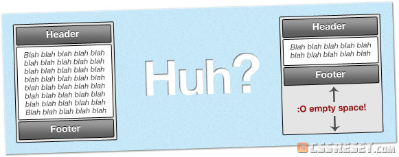
A familiar problem for many developers. A stunning design, perfectly crafted in semantic markup and CSS, that looks perfect in every browser… until you have a page without much content on it.

Many people using dummy content on a standard-sized monitor will not notice this issue. Some might even argue that it’s not worth fixing at all… but I think they’re wrong, and just in case you agree, I’m going to show you a simple way to fix it.
But you will be able to spend more time on the layout of your site if, in time, you ask yourself the question “maybe I should buy a dissertation?”. So you can rely on experts and spend more time on your own site.
The Problem:
In case you didn’t see the graphic above, or didn’t understand, here it is in a nutshell:
When a page contains a large amount of content, the footer is pushed down off the viewport, and if you scroll down, the page ‘ends’ at the footer. However, if the page has small amount of content, the footer can sometimes ‘cling’ to the bottom of the content, floating halfway down the page, and leaving a blank space underneath.
Depending on the design, this can look a little amateur, and it’s especially bad on large screens.
I’ve seen many failed attempts to fix this with absolute positioning, where the footer is forcibly positioned at the bottom of the screen – which usually ends up in it either overlapping (hiding) the bottom of the page content, or staying in the same position when the viewport is scrolled (eg. flying up the page when you scroll down) or not being pushed down far enough, or floating at the top of the page.
I’ve even seen people ‘fix’ it with Javascript, finding out the height of the page and pushing the footer down after page load. 8-O
Bad times.
The Solution:
… is suitable for use on almost any HTML/CSS layout, perfectly cross-browser compatible and 100% valid, degrades gracefully, doesn’t rely on any hacks (though one is possible for IE6), and most importantly, is damn easy : )
On long pages, the footer is pushed off the screen, as you’d expect. (Just like a real website!)
Also, it should work just the same on iPhones, iPods and iPads, and any other mobile devices that render CSS, although I haven’t had a chance to check this as of posting. Will update soon.
How Is It Done?
It’s surprisingly simple, really – once you get the hang of it you’ll start doing it automatically. Having said that, I still keep the snippet saved in Coda for easy referencing, as there are a couple things to remember.
Only four <div>s are required for this to work:
The HTML
<body>
	<div id="wrapper">
		<div id="header"></div>
		<div id="content"></div>
		<div id="footer"></div>
	</div>
</body>
The wrapper is a container for all the page content, which is here split into header, content and footer.
You can call these <div>s whatever you like – “wrapper” could be “container”, “content” could be “body”, “header” could even be “masthead”, if you’re into that. The main thing here is that the “wrapper” must be directly inside the <body> element as shown. Everything else is taken care of
