

CSS Transform Property
You may use the CSS transform property to visually modify an element by skewing, rotating, translating, or scaling it.
The transform attribute transforms an element in 2D or 3D space.
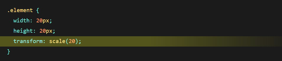
Even if a height and width are specified, this element will now be scaled to twenty times its original size.
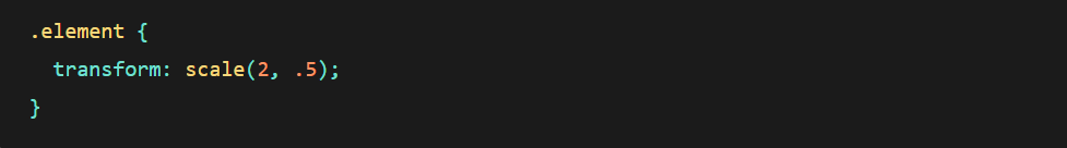
If you provide this function with two values, the first will extend it horizontally and the second will stretch it vertically. In the following example, the element will be twice the width but half the height of the original.
CSS Transform Values
- CSS Transform Scale()
This function Affects the element’s size. This also applies to an element’s font size, padding, height, and width. It also serves as a shortcut for the scaleX and scaleY operations.
- SkewX() and SkewY()
This function Tilts an element to the left or right, similar to converting a rectangle to a parallelogram. The skew X and skew Y transform functions tilt an element one way or the other. Also, there is no shorthand property for skewing an element, so you’ll need to use both functions.
- Translate()
This transform function moves an element sideways, or up and down. It’s important to note that an element using transform will not cause other elements to flow around it

- Rotate()
The element is rotated clockwise from its present location. A positive value rotates an element clockwise from its initial location, whereas a negative value rotates it in the opposite way.
- Matrix()
A function that combines all transformations into one and is presumably not intended to be written by hand.
- Perspective()
This function has no effect on the element itself, but it does alter the 3D transformations of descendant elements, letting them all have a consistent depth perspective.
See Also: Rotate HTML Elements Using CSS Transform
CSS Transform Scale
The CSS transform scale () method specifies a transformation that resizes a 2D planar element. It may resize the horizontal and vertical dimensions at different scales since the quantity of scaling is determined by a vector. It yields a <transform-function> data type as a result.
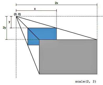
A two-dimensional vector characterizes this scaling change. Its coordinates specify how much scaling is performed in each direction. If both coordinates are the same, the scaling is uniform (isotropic), and the element’s aspect ratio is retained (this is a homothetic transformation).
When a coordinate value is outside the [-1, 1] range, the element expands along that dimension; when it is inside, it contracts. If the value is negative, the outcome is a point reflection in that dimension. A value of 1 has no meaning.
The scale() function only scales in 2D. To scale in 3D, use scale3d() instead.
The scale() method takes one or two arguments, which specify the amount of scaling to be done in each direction. I.e., Scale (sx) and Scale (sx, sy).
See Also: Manipulate Capitalization Using CSS’s Text-Transform
Scale Values
- SX : <A number> or <percentage> expressing the scaling vector’s abscissa.
- SY : A <integer> or <percentage> expressing the scaling vector’s ordinate. If it is not defined, the default value is sx, which results in uniform scaling that retains the aspect ratio of the element.
Scaling/zooming animations are troublesome for accessibility since they are atypical migraine triggers. If you must include such animations on your website, give an option that allows visitors to turn them off, ideally site-wide.

Consider using the prefers-reduced-motion media feature to create a media query that disables animations if the user has a reduced animation set in their system options.
See Also: Making Animations with CSS3 Transitions and Transform Features
Multiple Values to CSS Transform
You may add several values to the transform property using a space-separated list.
It’s important noting that these transformations are executed in a certain order; in the example above, ‘skew’ is performed first, followed by the element being scaled.
See Also: Responsive CSS Transitions: Tips and Tricks
Matrix Transform
All transformations may be combined using the matrix transform function. It’s similar to transform shorthand, but I don’t think it’s meant to be written by hand. There are tools available that can turn a collection of transforms into a single matrix declaration, such as The Matrix Resolutions. In certain cases, this may reduce file size, but author-unfriendly micro improvements like that are unlikely to be worth your effort.