
Adding shadows is a great way to create the illusion of depth and perspective, whether on a photograph, graphic design, or even on a web page! With the help of CSS3 properties, you can add such an effect to text, images, and other elements in a web page, without the need for jumping into Photoshop or other graphic editing software.
There are two properties you can use. Both these properties work in most browsers, and the following specifies the first browser versions that fully support them:
- text-shadow: Chrome 4.0, Internet Explorer 10.0, Firefox 3.5, Safari 4.0, and Opera 9.5
- box-shadow: Chrome 10.0, Internet Explorer 9.0, Firefox 4.0, Safari 5.1, and Opera 10.5
CSS3 Text Shadow
Just like other CSS properties, the text-shadow property is true to its name and adds a shadow to text. The basic syntax for this usually specifies only the horizontal and vertical shadow, plus the color. For example:
h1 {

text-shadow: 2px 2px red;

}
In the example above, the first 2px specifies the horizontal offset, and the second specifies the vertical offset. Red, of course, specifies the color of the shadow. If left unspecified, the default color is black. You can use either color names (such as red) or hex codes (such as #FFFFFF for white).
Adding a third pixel specification makes the shadow blur in that amount of pixels. For example:
h1 {

text-shadow: 2px 2px 5px red;

}
Using 0 horizontal and vertical offsets with a blur will create a neon-like glow effect. For example:
h1 {

text-shadow: 0 0 3px #FF0000;

}
Multiple Text Shadow Variations
You can add more than one shadow to a piece of text, using comma-separated values.
In the example below, there’s a purple-ish effect due to a 3-pixel wide red neon glow and a 5-pixel wide blue neon glow:
h1 {

text-shadow: 0 0 3px red, 0 0 5px blue;

}
In the example below, the white text has a gradient-like effect from a 2-pixel wide black neon glow, a 25-pixel wide blue neon glow, and a 5-pixel wide dark blue neon glow:

h1 {

color: white;

text-shadow: 1px 1px 2px black, 0 0 25px blue, 0 0 5px darkblue;

}
In the example below, the pink text has a plain black border around it, minus the shadows:
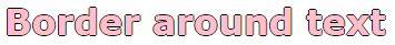
h1 {

color: pink;

text-shadow: -1px 0 black, 0 1px black, 1px 0 black, 0 -1px black;

}
CSS3 Box Shadow
The box-shadow property can apply shadows to non-text elements in a web page. It can be an image, div, or any other non-text element. While there are many complex ways of adding shadows, the ones discussed here are the most simple and straightforward ones.
The basic syntax for this usually specifies only the horizontal and vertical shadow, plus the color. For example:
.shadow {

box-shadow:         3px 3px 5px 6px #ccc;

}
In the example above, the first 3px specifies the horizontal offset, and the second specifies the vertical offset. The third value specifies the blur radius of 5px. The optional fourth value specifies the spread radius of 6px. Lastly, #ccc specifies the color of the shadow. If unspecified, the default color is black. You can use either color names (such as red) or hex codes (such as #FFFFFF for white), as well as rgba and hsla color values.
.shadow {

box-shadow:         inset 0 0 10px #000000;

}
In the example above, the word inset specifies that the direction is inwards. The first 0 specifies the horizontal offset, and the second specifies the vertical offset. The third value specifies the blur radius of 10px. Lastly, #000000 specifies the color of the shadow. If unspecified, the default color is black. You can use either color names (such as red) or hex codes (such as #FFFFFF for white), as well as rgba and hsla color values.
CSS3 properties can help you add personality to your work using color, depth and perspective. Play around with the codes above to add flavour to a photograph, graphic design, or web page. Happy designing!