
What Exactly Does Vertical Alignment Imply?
Vertical alignment is the condition or act of arranging objects to be stacked one on top of the other. This concept’s precise meaning changes depending on the situation. Vertical alignment has applications in a vast number of disciplines and subjects, and its meaning can vary substantially depending on the context.
See Also: Why Digital Marketers Should Learn Basic CSS and HTML
What is a <DIV> Tag?
In HTML, div tags are elements inserted to define parts of a document so that they are identifiable when a unique classification is necessary.
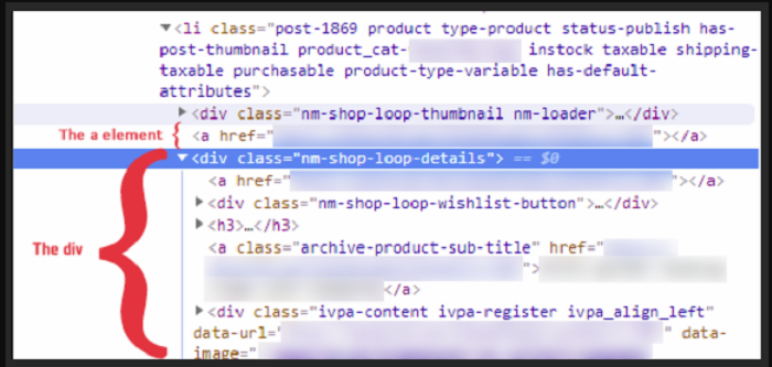
In an HTML document, the <div> element denotes a division or section. The <div> tag serves as a container for HTML components, which may then be decorated using CSS or changed using JavaScript. The class or id attribute can be used to customise the <div> element. The <div> element may include any type of information.
See Also: Understanding the Difference Between Div and Span
Alignment to Div Within a Div
Position, Top, Left, and Margin Properties
If you know the dimensions (width and height) of the divs, you may use the position, top left, and margin attributes to horizontally and vertically center a div within a div on a page.
To begin, in your HTML, enclose a div element in another div element. Use a class name like “child” for the inner div and “parent” for the outer div.
Then, in your CSS, style the outer div with the class selector .parent. Set the height, width, and color of the backdrop. The color will let you notice how the inner div is centered more clearly. The position attribute should then be set to “relative.”
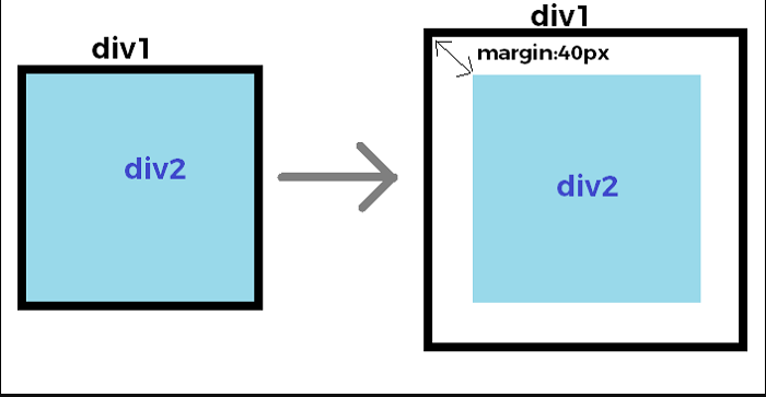
You may now style the inner div using the .child class selector. You may also change the height, width, and background color. Set the position attribute to “absolute” after that. Set the top and left attributes at 50% of their original value. Remember that this instructs the browser to align the div’s left and top edges with the parent container’s center vertically and horizontally.
If you stop there, you’ll fall into the identical problem as before: the child div will seem off-center since its corners are aligned in the parent container’s center. To correctly center the child div, use negative top and left margins. Each value should be half the child element’s height and width.
See Also: How To Link CSS To HTML
Position, Top, Left, and Transform Properties
Instead of using the margin property, you may use the transform property to vertically and horizontally center a div within a div whose dimensions are unknown. The CSS position, top, and left attributes will still be used.
To make the outer and inner divs in HTML, follow the methods above. Set the outer div’s height, width, background color, and position to “relative” in CSS as well.
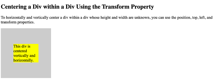
You’ll now style the inner div in a similar manner. You may change the background’s color and position to “absolute,” as well as the top and left properties to 50%. The width and height attributes, on the other hand, will not be defined.
You won’t even specify the margin attribute. Instead, you’ll use the transform property to position the child div 50% to the right and down from the container’s boundaries. The child div will be perfectly centered in the parent container as a result of this.
See Also: CSS and Metadata: The HTML Viewport Tag
Flexbox
Flexbox allows you to center a div within a div. Flexbox is a nice solution because it’s responsive and doesn’t require margin calculations, but it comes with a few more steps to remember.
To use Flexbox to center a div horizontally and vertically, set the HTML and body heights to 100 percent. If you want the parent container to take up the whole viewport, even if it’s resized, you may set its height to 100 percent. Instead, I’ll set the parent container to a specified height for this demonstration.
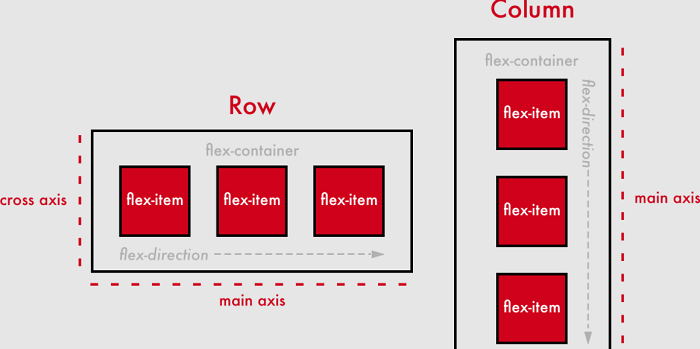
Additionally, the parent container must be defined as a flex container. Set the display property to “flex” to do this. Then set the properties align-items and justify-content to “center.” This instructs the browser to vertically and horizontally center the flex item (the div within the div).
See Also: Using CSS Flexbox in Responsive Design
