In CSS, it’s relatively easy and fairly common to use div elements to create different recognizable shapes. All it takes is one div element, a little (sometimes a lot, depending on the desired shape) CSS, and usually a basic understanding of how the border property works for even the most novice of developers to start making shapes quickly and easily.
In this tutorial, we’re going to show you how to get the ball rolling and create some fun, basic shapes.
The first shape we’ll make is the easiest: the square.
To start, you’ll need an empty div with the class “square”:
<div class="square"></div>
To make the square, you’ll need your CSS to look like this:
.square{
 width: 150px;
 height: 150px;
 background: #fc9f5b;
 }

In order to create a square, your div has to have a height and width of equal values. If they have different values, then you’ve got yourself a rectangle. The background color, as always, is up to you.
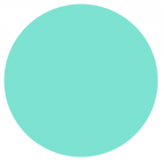
Next, let’s create a circle. Creating a circle is pretty much exactly the same as creating a square, only with one extra line of code. Just like creating any other shape, we’ll start with an empty div.
<div class="circle"></div>
Your CSS for the circle will be exactly the same as it was for the square, only with the addition of the line border-radius: 100%.
.circle{
 width: 150px;
 height: 150px;
 border-radius: 100%;
 background: #7de2d1;
 }
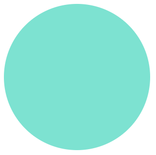
The addition of the border radius property rounds all the corners to create a circular shape. Just like with the square, it’s really important that the width of the div is the same value as the height, otherwise you’ll end up with an oval rather than a perfect circle. The values can be whatever you like and can be as big or as small as you want, they just have to equal each other.
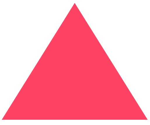
The last shape we’re going to create in part I of this tutorial is a little more complicated: the triangle. To build a triangle takes a bit more code than the first two examples, and involves the left, right, and bottom border properties.
Again, let’s start with an empty div:
<div class="triangle"></div>
Now it’s time for the CSS:
.triangle{
 width: 0;
 height: 0;
 border-left: 125px solid transparent;
 border-right: 125px solid transparent;
 border-bottom: 200px solid #ff4365;
}
To make the shape, we’ve got to give our div a width and height of 0. The size of the left and right borders are what determines the height of the triangle, while the bottom border determines the width. Make sure to remember to give the left and right borders a color value of transparent, otherwise you’ll end up with a square or a rectangle.