If CSS properties attended high school, you would never expect to see the border property sitting at the cool kids’ table. Sure, it’s a useful property and all — as long as you’re looking accentuate the boxiness of a design, right?
Actually, you’d be surprised at just how cool the border property can be. Please take the following dozen exhibits as proof that the CSS border property is a lot cooler than we give it credit for.
Jazzing Up Anchors
I’ve written here before about jazzing up anchor tags by changing the color, removing the underline, and adding background images. But border can be a great way to add a bit of visual style to your anchors without adding that great bit of accessibility that the underline provides. For example, CSS Newbie’s article links are currently styled with a dotted border, like so:
.entry a {
	color: #253c93;
	text-decoration: none;
	border-bottom: 1px dotted #253c93; }
.entry a:hover {
	border-bottom: 1px solid #253c93; }
That gives me a nice dotted border that turns solid when the user hovers over the link. All sorts of style and accessibility without that so-’90s underline.
Build a Postage Stamp
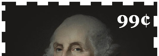
A while back, I ran across a cool little technique for faking a postage stamp using the CSS border property. The original link seems to have been lost from the web, but here’s the basic technique, in XHTML:
<div class="stamp">
<p>99¢</p>
</div>
And CSS:
.stamp {
	width: 500px;
	height: 414px;
	background: #fff url(george.jpg) no-repeat;
	border: 12px dashed #1b1a19; }
.stamp p {
	color: #fff;
	margin: 10px 10px 0 0;
	font: bold 60px Georgia, "Times New Roman", Times, serif;
	text-align: right; }
Now, you could obviously take this even further with a bit of skill and a degree in something other than Rhetoric, but I think you get the idea. You can see the example live here.
Prettier Images
Borders are a great way to make your excellent images stand out even more. I wrote an article on the subject a while back, but here’s the basic idea:
img.photo {
	border: 1px solid #999;
	background-color: #fcfcfc;
	padding: 4px;}
You can see a similar technique used on CSS Newbie’s current design around all of the images in the articles, as well as the ads in the sidebar. As you can see, the technique can be subtle but visually pleasing if used properly.
Homemade Coupons
If you’re ever required to design an online coupon, you needn’t turn straight to Photoshop or the like. You can craft a coupon easily with just a bit of CSS:
.coupon {
	width: 250px;
	padding: 10px;
	text-align: center;
	border: 3px dashed #ccc; }
Just that speck of code gives me a nice coupon that looks something like this:
You’ll have your readers printing and clipping in no time.
Better Blockquotes

Blockquotes are often useful, seldom used. But if you have a website that often refers to the words of others, a well-styled blockquote will go a long way towards impressing your readers with your borrowed prose:
blockquote {
	margin: 1em 3em;
	color: #999;
	border-left: 2px solid #999;
	padding-left: 1em; }
Just a touch of code, and voila… instant credibility!
Hunt Archaic Code
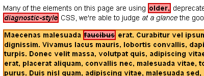
If you ever take over a website (or perhaps built a website) that is still using the Code of Yesteryear, consider turning to CSS and the border property for help hunting down bits of HTML soup that could use a bit less seasoning:
font, center, s, u, b, i {
	color: #000;
	font-weight: bold;
	background-color: #f99;
	border: 3px solid #c00; }
For more information on this useful technique, see my article on finding deprecated elements with diagnostic CSS highlighting. It just might save your life someday. But I doubt it.
Round the Bend
So far, all of our techniques have had one thing in common: boxy edges. But if you’re using a browser developed within the last five or so years (read: not IE6), you’re not limited to those same old dull right angles. This article from last August shows us that CSS3 offers us a way of breaking out of — or at least bending the corners of — the CSS box:
div.rounded {
	background-color: #666;
	color: #fff;
	font-weight: bold;
	padding: 10px;
	-moz-border-radius: 5px;
	-webkit-border-radius: 5px; }
The border-radius properties allow us to round the corners of elements without having to resort to images. Cool indeed!
Angle it In
Of course, not all angles are bad angles… if used properly. Way back in the day, CSS guru Eric Meyer pointed out a way to use borders to create some pretty wicked angles. If you’d like to learn more about this technique, his site is a great place to start.
CSS Drawings
And now for a bit of fun! The following excellent (and cool) examples are all drawn using the CSS border property.
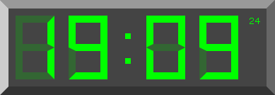
This functional LCD-style digital clock was built using CSS borders to create the lines of the LCD. Check out tanfa.co.uk to see it in action!
There’s something very pop-art about this CSS skyline. It leans heavily on the border property to create the buildings and windows.
Here’s a random art generator that combines HTML, JavaScript, and the CSS border property to create random examples of modern art. If you hit the “update” button long enough, you’re bound to find something worthy of hanging on your (cubicle?) wall.
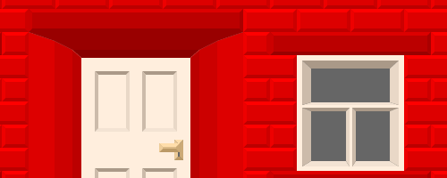
Christopher Hester is a man with fantastic CSS skill, incalculable patience, and presumably no girlfriend — at least until he started impressing the ladies with this house he built with the CSS border property. And be sure to check out his second CSS house, which he built using background colors and approximately 50 gazillion non-semantic divs.
If you know of any other fantastic uses for the CSS border property, be sure to mention them in the comments!


