A grid system provides designers with a structure to present their work in a much more manageable and readable way.
The grid systems helps in attaining a level of consistency in designs throughout a site. Here are 12 responsive CSS grid systems that help to make sites more more responsive, beautiful and organized.
1. Motherplate
This is a bare bone CSS3, HTML5 and SCSS responsive boilerplate that doesn’t support any visual components or stylings.

2. 1KB Grid
This is a simple grid system designed to use Sass and to remove classes from the HTML mark-up to make customization easier. It is inspired by the 1KB CSS Grid design. Now it has been extended to support fluid grids as well.
3. Bourbon Neat
Built on top of Bourbon and Sass, this CSS grid system is a semantic grid framework. With its simple design, it has the ability to handle any type of responsive layout.
4. Gridism
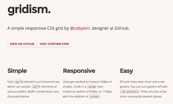
This is a simple and easy to use grid system. Grid units are stacked on screens smaller than 568px. On large screens the grids can have a width of 978px or 1140px.
5. Responsive Grid System
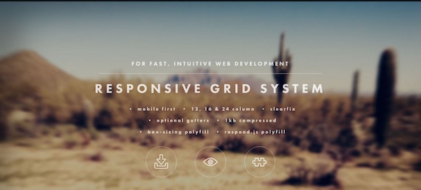
This grid system is designed for fast and intuitive development of responsive sites. The Responsive grid system is made available in 12, 16 and 24 columns. It is a fluid CSS framework available with media queries for different devices, clearfix and optional reset.
6. Skelton
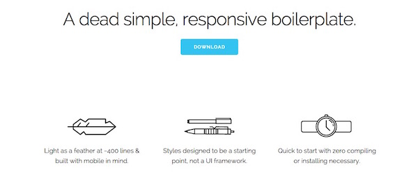
This responsive CSS grid system is used to develop sites that look beautiful on screens of any size. It is a collection of CSS files and is built on three principles – fast to start, responsive grid down to mobile and style agnostic.
7. Unsemantic
As a successor to the 960 grid system, this fluid grid system works in a similar way. The only difference is that instead of a set number of columns, it is based on percentages.
8. Less Framework
Developers can design adaptive websites using this CSS grid system. Less Framework consists of 3 sets of typography presets and 4 layouts, completely based on one grid. Using this framework designers can build a website with multiple layouts and make it look more efficient.

9. Herow
This Sass grid system saves time and provides designers with mixins that are easily customizable and simple to use. In order to deal with responsiveness problems, it also provides atomic mixins. Along with these, designers can also play with it in CSS by generating atomic classes.
10. ChewingGrid
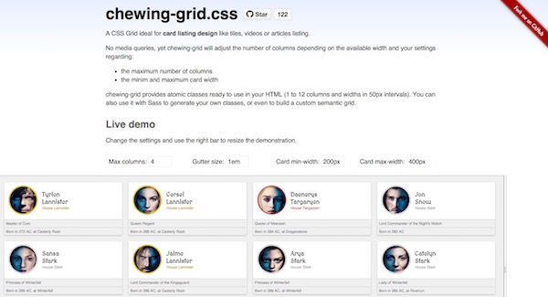
ChewingGrid allows designers to add a view that looks like a card listing template. This can be used to arrange videos, pictures or articles in a card view. Users can adjust the width of the card and also the number of columns that they wish to display. It can also be used to build custom semantic grids.
11. One % CSS Grid
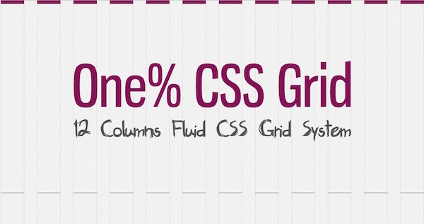
This grid system allows designers to create responsive web layouts quickly with ease. This is a percentage based 12 column grid system. It has only two start options, the one which fits 1024px and the other one that fits 1280px.
12. Fluid Baseline Grid
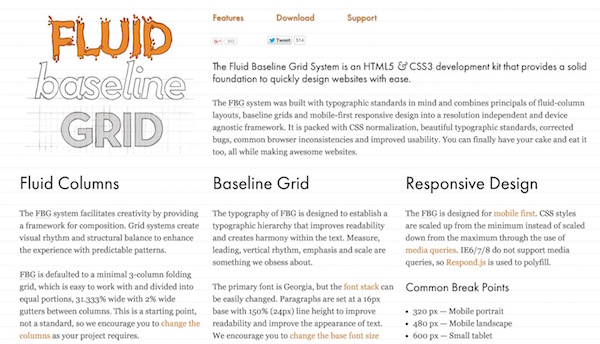
Built with typographic standards, the Fluid Baseline Grid system combines the principles of baseline grids, fluid column layouts and responsive design into a device agnostic and resolution independent framework. It features beautiful typographic standards, common browser inconsistencies, CSS normalization, corrected bugs and better usability.
