CSS’s box-shadow and text-shadow properties are incredibly versatile, allowing you not just to add shadows to various elements and text, but also making it possible to create cool, multi-dimensional effects for your projects. If you’re looking for inspiration on new ways to use shadows in your sites, check out this list of some of the most professional, smooth, and innovative ways that box and text shadows can be easily implemented in any projects.
This tutorial demonstrates how to apply a subtle, soft box shadow to your block level elements. The shadow in this tutorial is “diffused,” so the effect is a lot more realistic than your standard box-shadow code.
One of the coolest things about the text-shadow property is that it can be used to create unique 3D text effects. This snippet shows you how to use text-shadow to create a smooth shadow effect with an animated transition upon hover.
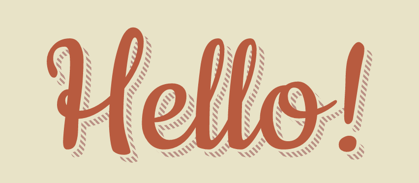
Not your average text-shadow effect — this snippet shows you how to create a text shadow that is dashed, rather than solid. Definitely a cool way to shake up the basic and expected solid text-shadow and add a little fun to your projects.
According to the author of this tutorial, flat design is a thing of the past. If you’re on board with the new 3D design trend, then you’ll probably love this take on shadows. This snippet shows you how to create icons, buttons, and text with long, exaggerated shadows to add a cool 3D effect to your projects.
Another take on long text-shadows, the shadows in this snippet are more diffused with a longer fade than the shadows in the tutorial above.
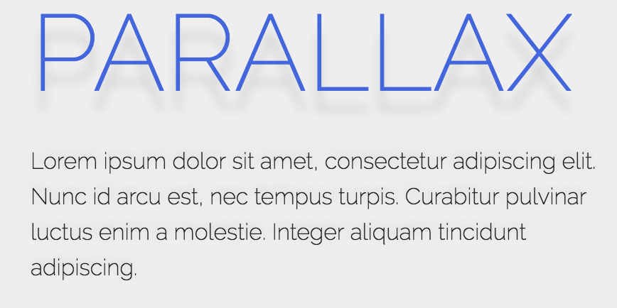
One of the more innovative tutorials on this list, the shadow in this snippet moves in conjunction with the scroll. So if the user scrolls down, the shadow effect on the text appears below the text. If the user scrolls back up, the shadow effect appears to move above the text. A pretty neat effect to add to any of your projects!


