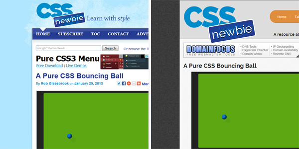

If you’ve been here before, you’ll probably notice things are looking quite a bit differently all of a sudden (and if you’re new to these parts, welcome!). For the first time in several years, CSS Newbie has a new design!
While there are many details of the new design I’d like to point out — and I fully intend to write some detailed articles about some of the techniques I’ve used in the near future — here are some basics:
- The site loads faster, as I’m making fewer HTTP requests.
- This is a responsive design, so the site looks much nicer on tablet and mobile devices.
- I’m using CSS3 techniques and icons fonts where I can in lieu of images.
- The logo is entirely HTML/CSS and is scalable.
So take a look around and let me know what you think in the comments. Love it? Hate it? Think it’s okay?
Also, if you see something amiss, please let me know — I’m anticipating this design to be more of an iterative, ongoing thing. Of course, that’s also code for “I haven’t tested this in all scenarios.” It seems to look decently in Chrome/Firefox on Windows and PC, and IE7 and up (though obviously some things change in older IE versions).
On an unrelated note, I’ll be in Orlando February 17th – 19th for the InControl conference. If you see me, stop by and say hello! I’ll look like a somewhat more bearded version of my photo in the footer.
