
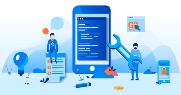
I am of the opinion that mobile apps should be more personalized. Some features I don’t need, others I use more often. But for some reason, we equate everyone in the same way in order to please more people a little bit at a time. A little farther along in terms of personalization are the news feeds and social networks, which provide unique content for everyone. For a long time, mvp design and development has become key stages in the creation of any product; partner companies can help you with them.
And what if we go even further and provide people with personalized UI in addition to content?
The concept
- The app itself understands what you use often and puts frequently used functionality on the first screen.
- It puts elements in order of importance on the page so that you don’t have to reach for it with your thumb.
- Depending on how often it’s used, the content will also be very different.
- There are also triggers: a push notification came, a certain date, or a user action. This trigger has its own specific weight, which is assigned to an individual item for a short time.
Choosing the boundaries of adaptivity
It should be said that 2 years ago, as it usually happens with everything new, the client was very wary of implementing adaptivity, because of the cost and misunderstanding of the benefits. Now 80% of our new projects have adaptivity as one of the mandatory requirements. However, the client still doesn’t really care about the limits of adaptivity, or there are cases where the client defines the limits erroneously.
Content Transformations
One of the most difficult and controversial stages of work. In fact, the stage for the sake of which all this adaptivity is necessary. The subject of heated discussions is what to do with the content when migrating between versions of the site designed for different devices.
The main options for working with content:
Transform structurally
As we reduce the working area of the browser window, we adjust the font, tables, change the number of images to publish per line, etc. This is a basic rule of working with content.
Hide/hide content
Content that, based on analytics and/or scripted user experience, is secondary, we hide behind some action (click, scroll), etc.
Change the priority
Sometimes it’s more important for the mobile audience to say or show something first, then we can change the priority of the content. Online stores, for example, can often quite clearly distinguish groups of products that interest the mobile audience more than the rest of the assortment.
Transform by meaning
This is where the fun part starts. Even if the goals of the mobile audience coincide with the goals of the “desktop” audience, it does not mean that we should not prepare the content including the semantic optimization. If you go to a site on a mobile, it will be a different site, and not all users will be happy to surf through a “pile” of pages of marketing text in search of answers.
What are we doing? We at ronasit do not let all the content from the desktop version move to mobile in the same way. The purpose of this optimization is solely to reduce the published volume and increase the speed of content consumption.