Gradient backgrounds are nice ways of displaying smooth transitions between two or more colors. Instead of relying on a graphic design software like Photoshop to create these effects, you can use simple CSS3 linear and radial gradients to create cool designs.
Apart from saving money on an expensive graphics software package, another great advantage of using CSS for gradients is that download times are significantly cut. While most people nowadays have high-speed internet connections, there are still some people with slower connections, or who use cellular data on mobile devices.
Various browsers support these gradient style properties:
Chrome 26.0, Internet Explorer 10.0, Firefox 16.0, Safari 6.1, and Opera 12.1
- linear-gradient
- radial-gradient
- repeating-linear-gradient
- repeating-radial-gradient
CSS3 Linear Gradients
Linear gradients can go down, up, left, right, or diagonally. In order to define a linear gradient, you will have to define two or more color stops – the colors you want to create smooth transitions with. In addition, you also have to set a starting point and direction or angle.
The basic syntax for this is:
background: linear-gradient(direction, color-stop1, color-stop2, ...);
Linear Top to Bottom Gradient
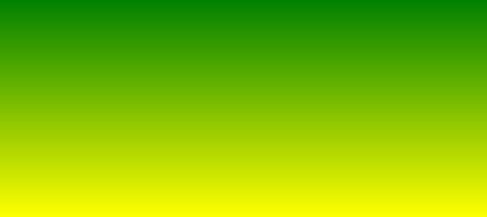
In the following example, the linear gradient goes from green (top) to yellow (bottom):

#grad1 {

height: 200px;

background: linear-gradient(green, yellow);

}
Linear Left to Right Gradient
In the following example, the linear gradient goes from blue (left) to violet (right):

#grad2 {

height: 200px;

background: linear-gradient(to right, blue , violet);

}
Angled Linear Gradient
In addition to the predefined gradient directions (to bottom, to top, to left, to right, to bottom left, etc.), you can define an angle by degree.

#grad3 {

height: 200px;

background: linear-gradient(-45deg, red, yellow);

}
Linear Gradient with Multiple Color Stops
As previously mentioned, you can also create gradients with multiple color stops. In the example below, there are three (red, yellow, and green). By default, they are evenly spaced. However, if you want to define the spacing, just type a percentage after each color (such as red 10%, green 85%, blue 90%).

#grad4 {

background: linear-gradient(red, yellow, green);

}
Repeating Linear Gradient
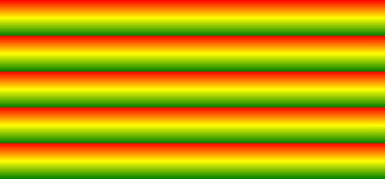
All of the previously mentioned linear gradient styles can be done in a repetitive style by adding the repeating- variation, as in the example below:

#grad5 {

background: repeating-linear-gradient(red, yellow 10%, green 20%);

}
CSS3 Radial Gradients
Radial gradients are defined by their center. In order to define a radial gradient, you will have to define two or more color stops – the colors you want to create smooth transitions with.
The basic syntax for this is:
background: radial-gradient(shape size at position, start-color, ..., last-color);
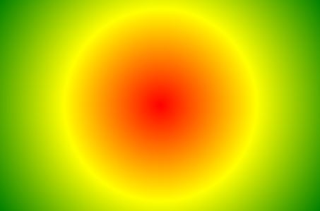
As with linear gradients, the default spacing for radial gradients is evenly spaced ellipses, but you may specify the shape (for example, either: ellipse or circle) and spacing by percentage (for example: red 5%, yellow 15%, green 60%).

#grad6 {

background: repeating-linear-gradient(red, yellow 10%, green 20%);

}
Repeating Radial Gradient
All of the previously mentioned radial gradient styles can be done in a repetitive style by adding the repeating- variation, as in the example below:

#grad7 {

height: 200px;

width: 300px;

background: repeating-radial-gradient(red, yellow 10%, green 15%);

}
Transparent Gradients
Lastly, you can also use CSS3 to create gradients that involve transparency, so very cool fading effects could happen. Simply use the rgba() function when defining the different color stops in any of the codes and examples used above. The rgba() function uses values of 0 to 1 – 0 meaning full transparency, while 1 means full color or zero transparency.

#grad8 {

background: linear-gradient(to right, rgba(255,0,0,0), rgba(255,0,0,1));

}
In the example above, the gradient starts from fully transparent towards becoming fully red.
