

In this CSS tutorial, we’re going to demonstrate how to create a bouncing text effect using only HTML and CSS. The text we’re about to create gives off the illusion of bouncing up and down on the viewport. The bounce effect is created using CSS animations and by manipulated CSS’s text-shadow property.
As you read through the tutorial, keep in mind that just about every stylistic choice you see, from font families to colors to even the speed of the bouncing animation are totally customizable and can always be changed to suit the needs of any project. The effect in this tutorial is adapted from this CodePen.
The HTML
Here’s the really simple part. To start, we’ll need some basic text. We’ve chosen to wrap our text in an <h1> tag, but you can use any text tag that you like. Take a look at our text snippet below:
<h1>bouncy</h1>
That’s it for the HTML. All of the hard work, styling, and animation occurs in the CSS.
The CSS
First off, we’re going to import our font family (we chose to use Chewy, from Google Fonts, but your own font choice is entirely up to you). We thought a big, chunky display text would work best with this sort of effect. As always, be sure to put the @import style rule that imports your font family at the very top of your stylesheet.
We’re also going to create some basic style rules that define how the page, the background, and should look. Take a look at the code below to see the first portion of our CSS code:
@import url('https://fonts.googleapis.com/css?family=Chewy');
body {
 position: absolute;
 top: 0;
 left: 0;
 right: 0;
 bottom: 0;
 width: 100%;
 height: 100%;
 background-color: #0fc59b;
 background-attachment: fixed;
 background-size: 100% 100%;
 overflow: hidden;
}
::selection {
 background: transparent;
}
body:before {
 content: '';
 position: absolute;
 top: 0;
 left: 0;
 right: 0;
 width: 0;
 height: 0;
 margin: auto;
 border-radius: 100%;
 background: transparent;
 display: block;
 box-shadow: 0 0 150px 100px rgba(255, 255, 255, .6),
 200px 0 200px 150px rgba(255, 255, 255, .6),
 -250px 0 300px 150px rgba(255, 255, 255, .6),
 550px 0 300px 200px rgba(255, 255, 255, .6),
 -550px 0 300px 200px rgba(255, 255, 255, .6);
}
Next, we’re going to start styling the text itself. We’ll define the positioning of it on the viewport, the font family, the margins and padding, and we’ll attach the animation effect to the text as well.
h1 {
 cursor: default;
 position: absolute;
 top: 30px;
 left: 0;
 right: 0;
 bottom: 0;
 height: 100px;
 margin: auto;
 display: block;
 -webkit-animation: bounce .3s ease infinite alternate;
 font-family: 'Chewy', cursive;
 font-size: 80px;
 color: #FFF;
 text-align: center;
 line-height: 100px;
 text-shadow: 0 1px 0 #CCC,
 0 2px 0 #CCC,
 0 3px 0 #CCC,
 0 4px 0 #CCC,
 0 5px 0 #CCC,
 0 6px 0 transparent,
 0 7px 0 transparent,
 0 8px 0 transparent,
 0 9px 0 transparent,
 0 10px 10px rgba(0, 0, 0, .6);
}
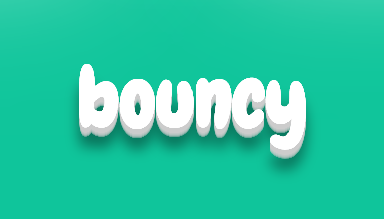
Now, our code should look like this:
Finally, we need to define the animation so that we can add the bounce effect. So far, we’ve only applied the animation effect to the text without actually defining what the animation should do. This is our last step. Take a look at the snippet below to see how you can define this particular animation in your CSS>
@-webkit-keyframes bounce {
 100% {
 top: -30px;

 text-shadow: 0 1px 0 #CCC,
 0 2px 0 #CCC,
 0 3px 0 #CCC,
 0 4px 0 #CCC,
 0 5px 0 #CCC,
 0 6px 0 #CCC,
 0 7px 0 #CCC,
 0 8px 0 #CCC,
 0 9px 0 #CCC,
 0 30px 30px rgba(0, 0, 0, .3);
 }
}
After you add this code, your text should bounce up and down on the viewport. If you want to slow down or speed up the animation, change the duration of the animation as it was applied to the h1 tag (currently, it’s at .3s, but it could be shorter or longer if you like).