Generally speaking, I consider full-fledged CSS frameworks to be overkill on all but the most absolutely complex projects or, on the other end of the spectrum, rapid proof-of-concept prototyping. Most people only use a few of the classes that any one CSS framework provides, but then still require their users to download the entire, and largely unused, stylesheet.
However, I still think that the foundation on which CSS frameworks are built — the concept of using classes to simplify layout and standardize design across similar elements — is very much worth investigation. But instead of relying on a one-size-fits-all (snuggie-esque?) solution, I’d encourage you to take a few minutes and build a custom, simplified framework that does exactly what you need it to do.
The Back Story
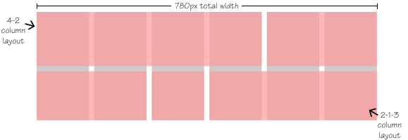
I recently built a website based on a fairly regular, consistent grid. The content area was 780px wide and would contain six “columns” of content with 12-pixel gutters between each of the columns, though various elements could span one or more of those columns.

Because of the general flexibility of the content combined with the rigidity of the columnar structure, my mind immediately jumped to frameworks as a way to get this design pushed out in a hurry. But in the end, I just couldn’t justify all that overhead, even to create a flexible six-column design. So instead, I decided to write my own mini-framework to do only what I needed.
The Custom Framework
Here’s the basic CSS I ended up writing:
.col {
	float: left; }
.gutter {
	margin-right: 12px; }
.span1 {
	width: 120px; }
.span2 {
	width: 252px; }
.span3 {
	width: 384px; }
.span4 {
	width: 516px; }
.span5 {
	width: 648px; }
.span6 {
	width: 780px; }
.clear {
	clear: left; }
Pretty simple stuff, right? All it contains is nine classes that I can arbitrarily assign to my structural divs to determine how the page will lay out. The first class, “col”, gets assigned to any div I want to behave like a column.
Then each column is given one of the “span” classes (using the benefit of multiple CSS classes to great effect) to determine its width — or as I thought of it at the time, the number of columns the div would span… just like using “colspan” in old-school table layouts.
Next up we have the “gutter” class, which I add to any column that should have a gutter along its right edge (which would be true for all columns except those along the very right edge of my content area). And finally, there’s a “clear” class, just to ensure that my divs behave themselves even if I didn’t entirely fill up the previous “row” of divs.
The XHTML Structure
There’s not much to the XHMTL structure for my custom framework. Essentially, it’s a bunch of divs given two or more of my nine classes to determine its behavior. For example, to create the 4-2/2-1-3 structure I highlighted in the image above, this would be the structure:
<div class="col span4 gutter">Four columns</div>
<div class="col span2">Two columns here</div>
<div class="col span2 gutter">Two cols and a gutter</div>
<div class="col span1 gutter">Only 120px!</div>
<div class="col span3">Three columns.</div>
If you’d like to see this sort of custom framework in action, it’s running on the website for the Woodsmith Shop TV show.
One Size Doesn’t Fit All
Now, I’m not saying my framework is the end-all CSS framework and that you should just copy it wholesale into your own project and expect it to work perfectly. The idea here is to take this concept and come up with a custom framework that works perfectly for your needs.
The real take-away lesson here is that for most projects, you don’t need dozens of classes and hundreds of lines of CSS just to create a flexible grid structure. I created mine with just nine CSS classes and it was sufficient to power my six-column grid. I’d be interested to see what other people (namely, you) have come up with along these same lines. Share a link in the comments!

