
With minimalist side design still on the rise, it’s sometimes easy for website visitors to get confused. Navigating a website should be easy and intuitive, and is one of the most important elements of a website. Using CSS, you can turn simple HTML menus into dynamic and aesthetically pleasing navigation bars.
Responsive Design
As the majority of people today use their mobile gadgets like cellphones and tablets to go online, it also goes without saying that your site’s design should look good on both desktops and mobile devices.
If you are new to web design and the concept of “responsive” design seems foreign to you, basically it refers to your designs ability to “flow” as you resize the screen or move to a device with a smaller width. Responsive design is built to work on both big and small screens, and this includes the navigation or menu bar visitors use to access other pages of your site.
Navigation Bar Skeleton
Just like many of our tutorials, you will have to combine HTML knowledge with CSS techniques to successfully build and design interesting websites. A navigation bar, in this case, will need a basic HTML skeleton that lists the different links you want to list.
Remember the unordered list <ul> and list item <li> HTML tags? We will use that as the skeleton.
<ul>

<li><a href="#home">Home</a></li>

<li><a href="#products ">Products</a></li>

<li><a href="#company ">Company</a></li>

<li><a href=" #contact ">Contact</a></li>

</ul>
The best part about this is that you will only need to update the CSS for changes to appear on your menu – no further tweaking in the HTML body is necessary!
Formatting the Links List
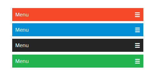
So how do we turn a simple bulleted links list into something like this?
First, using CSS (which we will either enter between the <style> tags in the <head> or in an external CSS file), we can remove the bullets and margins/padding that automatically formats a list by default:
ul {

list-style-type: none;

margin: 0;

padding: 0;

}
This code will work for both vertical and horizontal navigation bars.
Formatting into a Vertical Navigation Bar
We will now further modify the above CSS so that the <a> element will also have a customized style:
li a {

display: block;

width: 60px;

}
display: block; turns the links into block-type elements, making the entire block area clickable instead of just the text. Above, we modified only the width, but you can also modify other elements such as margin, height, padding, colors, and many other aspects.
Formatting Into a Horizontal Navigation Bar
There are two ways to modify the basic CSS to create a horizontal navigation bar – either inline or floating.
Inline Horizontal Nav Bar
When you edit the <li> element’s CSS style as in this example, you are telling the browser to get rid of the line breaks that format each list item, so they display horizontally in one line.
li {

display: inline;

}
Floating Horizontal Nav Bar
The second method of creating a horizontal navigation bar is to make the elements float:
li {

float: left;

}


a {

display: block;

padding: 8px;

background-color: #dddddd;

}
Using float, the individual block elements or list items will slide next to each other.
Specifying the “Active” Link
You can use a nifty CSS trick so the visitor knows which page on your site they are on:
.active {

background-color: #4CAF50;

}
The .active class is now a different color than the rest of the menu when the visitor is on a specific page of your website.
Fixed Navigation Bar
You can make the nav bar stay on the top or bottom of your page, even when the visitor scrolls the page, using one of the following codes:
For fixed top navigation bars, use:
ul {

position: fixed;

top: 0;

width: 100%;

}
For fixed bottom navigation bars, use:
ul {

position: fixed;

bottom: 0;

width: 100%;

}
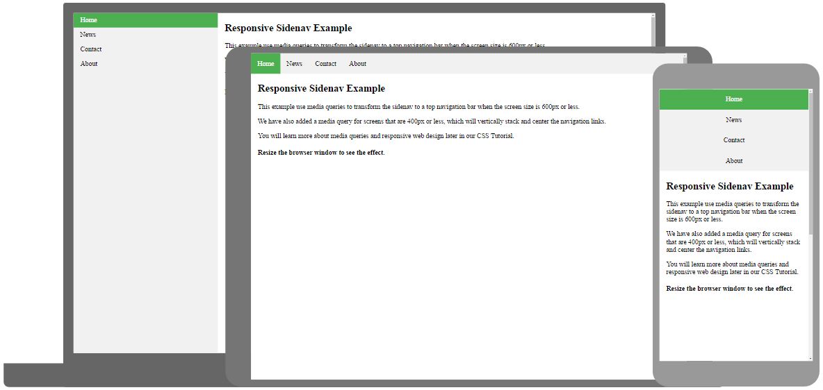
Responsive Navigation Bars
You can use CSS media queries so your top or side navigation bars will become responsive and would work on mobile devices like a tablet or cellphone. Just specify the widths and heights as in the codes below.
For responsive top navigation bars, use:
ul.topnav {

list-style-type: none;

margin: 0;

padding: 0;

overflow: hidden;

background-color: #333;

}


ul.topnav li {float: left;}


ul.topnav li a {

display: block;

color: white;

text-align: center;

padding: 14px 16px;

text-decoration: none;

}


ul.topnav li a:hover:not(.active) {background-color: #111;}


ul.topnav li a.active {background-color: #4CAF50;}


ul.topnav li.right {float: right;}


@media screen and (max-width: 600px){

ul.topnav li.right,

ul.topnav li {float: none;}

}
For responsive side navigation bars, use:
ul.sidenav {

list-style-type: none;

margin: 0;

padding: 0;

width: 25%;

background-color: #f1f1f1;

position: fixed;

height: 100%;

overflow: auto;

}


ul.sidenav li a {

display: block;

color: #000;

padding: 8px 16px;

text-decoration: none;

}


ul.sidenav li a.active {

background-color: #4CAF50;

color: white;

}


ul.sidenav li a:hover:not(.active) {

background-color: #555;

color: white;

}


div.content {

margin-left: 25%;

padding: 1px 16px;

height: 1000px;

}


@media screen and (max-width: 900px) {

ul.sidenav {

width: 100%;

height: auto;

position: relative;

}

ul.sidenav li a {

float: left;

padding: 15px;

}

div.content {margin-left: 0;}

}


@media screen and (max-width: 400px) {

ul.sidenav li a {

text-align: center;

float: none;

}
Conclusion
There you have it! Don’t forget to have fun experimenting with colors, borders, and other cool tricks you have learned.