
An image gallery is a very useful part of a website, as it can showcase photographs, pieces of art, and other visuals for whatever purpose you may need. This can work great for artists who want to display their art and photography, bloggers who want to share a few photos of something they reviewed, travellers who want to exhibit photos from a recent trip, or other similar purposes.
This tutorial covers how to use CSS to create a simple image gallery for your website. It’s very simple, and all you need is a few snippets of code to set it all up! It can be done two ways: regular and responsive.
If you are new to making websites, responsive means the gallery will adjust based on the computer or gadget that your viewers are using. For example, the gallery displays a grid consisting of 4 columns when viewed on a laptop, but only 1 column when viewed on a mobile device. We have a separate section for responsive web design, which includes media queries and sizing images responsively. You can read these for more information so you can better understand what’s going on in this tutorial, although it’s not really required.
Basic Image Gallery
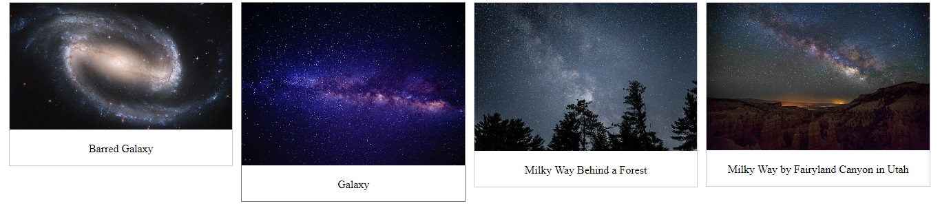
First, here is a sample of a basic image gallery that was created using CSS:
The code used is as follows. You can of course replace all the elements as needed.
In the <style> section, which is found in the <head> of the web page, we defined the gallery’s properties, including the images’ margins, borders, widths, heights, and even what happens when a user hovers over them. In addition, we defined what the description or caption will look like.
div.gallery {
 margin: 5px;
 border: 1px solid #ccc;
 float: left;
 width: 180px;
 }
div.gallery:hover {
 border: 1px solid #777;
 }
div.gallery img {
 width: 100%;
 height: auto;
 }
div.desc {
 padding: 15px;
 text-align: center;
 }
In the <body> part of the web page, you can then define each image, including where the images link to and what text goes in their descriptions, all within the <div> element. In this basic example, clicking an image in the gallery opens a full version of that image in a new tab.
<div>
 <a target="_blank" href="fjords.jpg">
 <img src="fjords.jpg" alt="Fjords" width="300" height="200">
 </a>
 <div>Add a description of the image here</div>
 </div>
<div>
 <a target="_blank" href="galaxy1.jpg">
 <img src="galaxy1.jpg" alt="Barred Galaxy" width="300" height="200">
 </a>
 <div>Barred Galaxy</div>
 </div>
<div>
 <a target="_blank" href="galaxy2.jpg">
 <img src="galaxy2.jpg" alt="Galaxy" width="300" height="200">
 </a>
 <div>Galaxy</div>
 </div>
<div>
 <a target="_blank" href="galaxy3.jpg">
 <img src="galaxy3.jpg" alt="Milky Way Behind a Forest" width="300" height="200">
 </a>
 <div>Milky Way Behind a Forest</div>
 </div>
<div>
 <a target="_blank" href="galaxy4.jpg">
 <img src="galaxy4.jpg" alt="Milky Way by Fairyland Canyon in
Utah" width="300" height="200">
 </a>
 <div>Milky Way Behind by Fairyland Canyon in Utah</div>
 </div>
Making the Gallery Responsive
As mentioned above, a gallery can become responsive, based on the size of your viewer’s mobile gadget screen, or even their laptop’s browser window. This is possible using media queries, which are added to the CSS in the <style> section. Here the CSS dictates points in a screen where the gallery is supposed to create a new row. In this example we used 480 pixels, 650 pixels, 1050 pixels, and 1290 pixels, which are common screen sizes.
.responsive {
 padding: 0 6px;
 float: left;
 width: 24.99999%;
 }
@media only screen and (max-width : 480px) {
 .responsive {
 width: 100%;
 padding-bottom: 100%;
 }
 }
 @media only screen and (max-width : 650px) and (min-width
: 481px) {
 .responsive {
 width: 50%;
 padding-bottom: 50%;
 }
 }
 @media only screen and (max-width : 1050px) and (min-width
: 651px) {
 .responsive {
 width: 33.3%;
 padding-bottom: 33.3%;
 }
 }
 @media only screen and (max-width : 1290px) and (min-width
: 1051px) {
 .responsive {
 width: 25%;
 padding-bottom: 25%;
 }
 }
Remember that to make your original basic gallery responsive, you have to define it as a separate class. In our example HTML, we have defined it both as “responsive” and as “gallery” as in the code shown here:
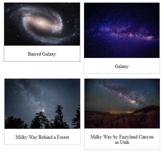
<div>
 <div>
 <a target="_blank" href="galaxy1.jpg">
 <img src="galaxy1.jpg" alt="Barred Galaxy" width="300"
height="200">
 </a>
 <div>Barred Galaxy</div>
 </div>
 </div>
<div>
 <div>
 <a target="_blank" href="galaxy2.jpg">
 <img src="galaxy2.jpg" alt="Galaxy" width="300" height="200">
 </a>
 <div>Galaxy</div>
 </div>
 </div>
<div>
 <div>
 <a target="_blank" href="galaxy3.jpg">
 <img src="galaxy3.jpg" alt="Milky Way Behind a Forest"
width="300" height="200">
 </a>
 <div>Milky Way Behind a Forest</div>
 </div>
 </div>
<div>
 <div>
 <a target="_blank" href="galaxy4.jpg">
 <img src="galaxy4.jpg" alt="Milky Way by Fairyland Canyon
in Utah" width="300" height="200">
 </a>
 <div>Milky Way by Fairyland Canyon in Utah</div>
 </div>
 </div>
Conclusion
That’s all it takes to create a gallery using simple CSS and HTML codes! You can go ahead and jazz up your site with a gallery or two, or make your blog post even more interesting than it already is. Just make sure to check your code and preview the result before publishing to make sure everything works smoothly for your website’s visitors.