I want to take a moment today and talk about CSS floats. They’re used everywhere in modern web design, from navigation bars to building CSS columns and dozens of techniques in between. However, despite their prevalence, not everyone understands exactly how they work, or what the repercussions might be from using them. So let’s remedy that. You can see all the examples from this article here.
CSS Float Basics
Floated elements are a different beast than anything else in CSS. Floats are technically block-level elements, but they behave like inline elements in that they often don’t exist on a line of their own — the rest of your content will try to flow around a floated element.

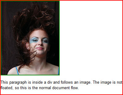
Floated elements exist outside the normal document flow, which is a fancy phrase that basically says that the order an element appears in the source code determines where it should appear on the final rendered page (see above). Floated and positioned elements are both outside the normal document flow. But floats don’t behave like a regular positioned element.
An absolute or fixed positioned element leave the document flow entirely and sit on top of the normal document, and the space that would have been occupied by that element in the normal document flow is closed. Relatively positioned elements also leave the normal document flow, but the space they took up in the document isn’t closed up: it stays open and in the same spot the element originally sat, regardless of where the element moves.
Floats are different. They leave the document flow and the space they take up is reserved like in a relatively positioned element, but that space moves with the element. The normal document flow then does what it can to flow around that element. If the content following the float will fit beside it, it will do so.
You have two real options with floats: left, and right. The floated element will then move as in that direction as far as it can within its containing element. The content flowing around it can be held at bay by margins, padding or borders on the float.
Working With Floats
So let’s start playing around with floats. We’ll use an example that often throws people for a loop. Let’s say you have a div which contains an image that you plan to float, plus a paragraph of descriptive text that you want to flow around the element. Our HTML might look like this:
<div class="container">
	<img src="anything.jpg" class="float" />
	<p>This is my descriptive paragraph.</p>
</div>
In this example, we’ll give our container and the image a border in addition to floating our image, so we can see how they’re behaving. Here’s our CSS:
.container {
	margin: 1em 0;
	border: 2px solid red;}
.float {
	float: left; }
img {
	border: 2px solid green;
	margin: 0 .5em 0 0; }
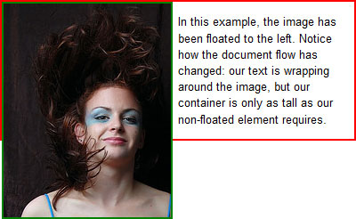
So what’s the result? Something that looks like this:
You can see this live on our example page, as well.
Woah. Unless you’re an experienced float-tamer, this is probably not the result you were expecting or looking for. And it isn’t a bug of any sort. According to the CSS spec:
[F]loating elements can overlap with the margin, border and padding areas of other elements … when the floating element is wider or higher than the element it is inside.
In short, any time your floated element is larger than its container, it will appear to overflow that container. I say “appear” because, as we established earlier, floats exist outside the normal document flow like positioned elements. They’re not contributing to the height of their container at all. The height of the container in our example is being decided by the paragraph’s contents.
So how do we ensure that our float stays within our container? There are two good options.
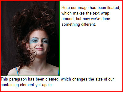
The first option is to use a clear, which is a CSS property that forces elements to not flow around floats. So if we place a clear somewhere after our floated element in our container, our container will be forced to compensate for the space the cleared element is taking up. And since our cleared element is below our float, it compensates for the float’s height as well:
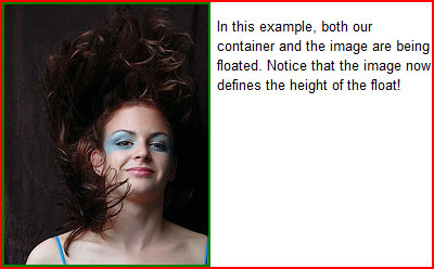
Of course, that requires using an additional element in our HTML — one that may or may not have any semantic value. But there is another alternative that not everyone realizes: a floated element inside another floated element determines that float’s size!
I realize that might sound like gibberish. Let’s go back to our example code, but instead of just floating our image, let’s float the container div as well. As you can see on the example page, here is our result:
Much nicer. And probably closer to what we were expecting, too.
Note that I’ve also specified a width on the container when I floated it: floated elements should always have a width, or browsers may determine their widths differently. Technically speaking the width of the container should be as big as the largest contained element, but when we’re dealing with text that gets complicated… would the largest element be the longest sentence or the longest word? Images are an exception to this rule, because images have an implied width.
So now you hopefully have a better understanding of what floats are actually doing, and how to use them in your work. For more on floats and positioning, see the articles below or visit the table of contents.


