

CSS Parallax scrolling is a website trend where the background content is moved at a different speed than the foreground content while scrolling. It is a computer graphics method in which background pictures move more slowly past the camera than foreground ones, providing the sense of depth in a 2D scene of distance.
CSS parallax scrolling, which gives a feeling of depth on your site, is extremely effective and fascinating. When browsing through websites that employ this design impact, it’s difficult not to be motivated to apply it on your own.
You may design interesting, scrolling elements that assist convey the story of your company by utilizing Cascading Style Sheets (CSS), the scripting language used to enhance the aesthetic of your website.
This can refer to backdrop modifications or things in semi-fixed positions that move in tandem with the user’s scrolling. We’ve gone through a lot of website examples, but we haven’t gone over the approaches in depth.
These are some well-known CSS parallax scrolling snippets for building parallax layouts for this collection.
See Also: Five Informative CSS Blogs All Designers Should Follow
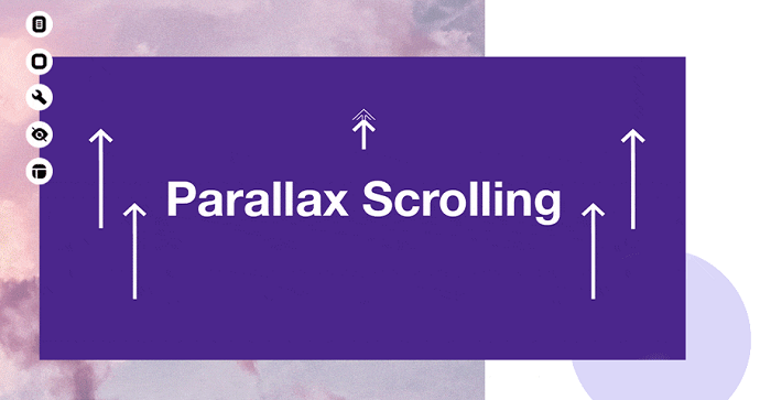
CSS Scrolling Parallax
A more realistic parallax effect with fixed background and bigger pages on top is seen here. Each page portion shows above the background as you scroll. This provides the perception of depth and is one of the most important aspects of a good parallax design.

Sebastian Schepis created this page entirely with CSS, and it’s a rather basic concept. I believe anyone could easily clone this, and the backdrop design might be considerably improved.
See Also: 10 Beautiful CSS Text Effects
Parallax Design by Katie Rogers
Here’s a unique parallax design for an example wedding page. It has a split page design with pictures separating the various content regions with parallax fixed scrolling. Everything is powered by CSS, which is a wonderful touch, and all background pictures remain fixed as you go down the page.
Because the content sections have enormous box shadows falling over the backdrops, this effect works. Naturally, by providing the page a theoretical light source and hierarchy, this provides the appearance of depth – a very excellent idea for a single-page layout.
See Also: 15 New Awesome Creative CSS Animations
Paulo Cunha’s CSS Parallax
This parallax example is a one-of-a-kind demonstration of how parallax effects operate. The whole page’s content is housed behind a huge hero picture, which vanishes beneath the text as you scroll. This also uses the fixed picture location to create the illusion that the page is moving over the image rather than the image remaining fixed in place.

This effect may be used with a lengthy scrolling layout to get a similar design style. This would be best suited for single blog articles with huge featured photos or landing pages with enormous heroes to draw attention.
See Also: Understanding CSS Basics: What is Cascading?
Saransh Sinha created the starry parallax background.
While this effect has nothing to do with scrolling, it is intimately related to parallax design. It creates a parallax star animation in the page’s backdrop using only CSS. You may add text and even a content section to the page, but the stars provide depth right away.
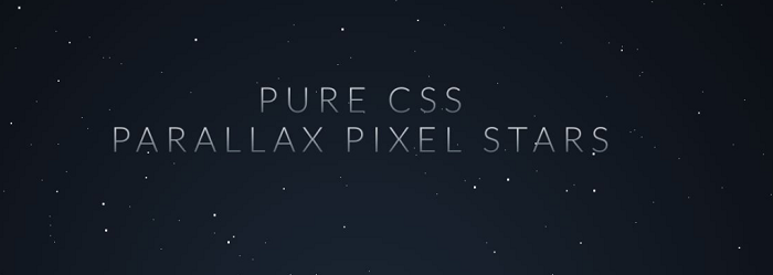
The animation is handled by CSS; however, this sample employs Sass and Compass, which should be understood before making changes.
See Also: Styling Your Links Through CSS
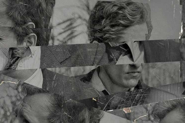
Bajjy Xilo’s Broken Glass Filter
After noticing this effect previously on websites, resulting in a pretty unusual look, the shattered glass filter creates the idea that a background picture has been divided into several separate sections. It nearly appears as though the image was on a pane of glass that cracked, fracturing, and skewed the image.
This effect can be replicated using only CSS, and it’s one of those fantastic effects that look good but may not have any practical, real-world applications other than pretty designs. Nonetheless, this is an outstanding demonstration of parallax depth and motion when scrolling.
Paulo Cunha’s CSS Parallax
This parallax example is a one-of-a-kind demonstration of how parallax effects operate. The whole page’s content is housed behind a huge hero picture, which vanishes beneath the text as you scroll. This also uses the fixed picture location to create the illusion that the page is moving over the image rather than the image remaining fixed in place.

This effect may be used with a lengthy scrolling layout to get a similar design style. This would be best suited for single blog articles with huge featured photos or landing pages with enormous heroes to draw attention.
How CSS Parallax Scrolling is Effective?
Today’s online user wants to be entertained and involved. People are more than happy to interact with a website if they are encouraged to do so. You can do a lot of cool things using parallax scrolling to encourage your visitors to interact with your site. In web design, parallax scrolling may be utilized to achieve a variety of goals. You may showcase your goods in novel and exciting ways or tell more vivid and interactive tales.
The instant feedback provided by CSS parallax scrolling is both exciting and encouraging. There are a lot of articles out there with beautiful, fantastic, or even awesome examples of parallax scrolling in web design. While these collections provide lots of ideas for how to implement parallax scrolling, they don’t explain why we should. The interactive element of parallax scrolling is clear, as is the amount of engagement that it brings.