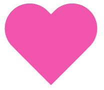
With Valentine’s Day season upon us, you might find yourself wanting to add some seasonal flair to your websites or projects. An easy way to do this is by adding heart shapes to your pages. You can do this by using a heart graphic or by using CSS to style a div element to look like a heart. Creating a heart shape out of a div takes more than a few lines of code, but it’s not terribly complicated. Take a look at the snippet below to see how you can do it for your own projects:
Here’s what your HTML should look like:
<div id="heart"></div>
And your CSS:
#heart {
 position: relative;
 width: 100px;
 height: 90px;
}

#heart:before,
#heart:after {
 position: absolute;
 content: "";
 left: 50px;
 top: 0;
 width: 50px;
 height: 80px;
 background: #f054ad;
 -moz-border-radius: 50px 50px 0 0;
 border-radius: 50px 50px 0 0;
 -webkit-transform: rotate(-45deg);
 -moz-transform: rotate(-45deg);
 -ms-transform: rotate(-45deg);
 -o-transform: rotate(-45deg);
 transform: rotate(-45deg);
 -webkit-transform-origin: 0 100%;
 -moz-transform-origin: 0 100%;
 -ms-transform-origin: 0 100%;
 -o-transform-origin: 0 100%;
 transform-origin: 0 100%;
}

#heart:after {
 left: 0;
 -webkit-transform: rotate(45deg);
 -moz-transform: rotate(45deg);
 -ms-transform: rotate(45deg);
 -o-transform: rotate(45deg);
 transform: rotate(45deg);
 -webkit-transform-origin: 100% 100%;
 -moz-transform-origin: 100% 100%;
 -ms-transform-origin: 100% 100%;
 -o-transform-origin: 100% 100%;
 transform-origin :100% 100%;
}
As you can see, the shape is built primarily using the :before and :after pseudo-selectors, which is how the symmetrical curved shapes are formed. Have fun experimenting with this code and adjusting the color and size to your liking.
