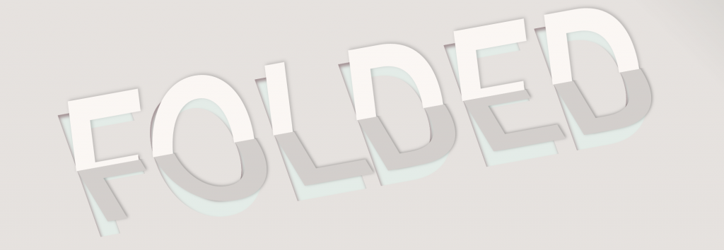
Text effects are one of the most fun ways that you can play around with CSS to change the appearance of standard HTML tags. In this tutorial, we’ll demonstrate how to use the text shadow and transform properties to create a line of text that appears as though it’s been folded in half. Take a look at the snippet below, originally adapted from this CodePen tutorial.
To start, you’ll need some HTML. This part is very straightforward, all you really need are a div and an h1 tag:
<div class="wrapper">
     <h1 text-data="Folded">Folded</h1>
</div>
Now it’s time to add the CSS to create that folded in half effect. Here’s how your CSS code should look:
@import url('https://fonts.googleapis.com/css?family=Source+Sans+Pro');
html, body {
 height: 100%;
}
body {
 background: -webkit-linear-gradient(45deg, #e6e2df 80%, #c2c1bd 100%);
 background: linear-gradient(45deg, #e6e2df 80%, #c2c1bd 100%);
}
.wrapper {
 width: 100%;
 font-family: 'Source Sans Pro', monospace;
 margin: 0 auto;
 height: 100%;
}
.wrapper h1 {
 text-transform: uppercase;
 -webkit-transform: translate(-50%, -50%) skew(10deg) rotate(-10deg);
 transform: translate(-50%, -50%) skew(10deg) rotate(-10deg);
 font-size: 20vw;
 top: 50%;
 left: 50%;
 margin: 0;
 position: absolute;
 text-rendering: optimizeLegibility;
 font-weight: 900;
 color: rgba(227, 247, 240, 0.5);
 text-shadow: 1px 4px 6px #e6e2df, 0 0 0 #66303a, 1px 4px 6px #e6e2df;
}
.wrapper h1:before {
 content: attr(text-data);
 position: absolute;
 left: 0;
 top: -4.8%;
 overflow: hidden;
 width: 100%;
 height: 50%;
 color: #fbf7f4;
 -webkit-transform: translate(1.6vw, 0) skew(-13deg) scale(1, 1.2);
 transform: translate(1.6vw, 0) skew(-13deg) scale(1, 1.2);
 z-index: 2;
 text-shadow: 2px -1px 6px rgba(0, 0, 0, 0.2);
}
.wrapper h1:after {
 content: attr(text-data);
 position: absolute;
 left: 0;
 top: 0;
 overflow: hidden;
 width: 100%;
 height: 100%;
 z-index: 1;
 color: #d3cfcc;
 -webkit-transform: translate(0vw, 0) skew(13deg) scale(1, 0.8);
 transform: translate(0vw, 0) skew(13deg) scale(1, 0.8);
 -webkit-clip-path: polygon(0 50%, 100% 50%, 100% 100%, 0% 100%);
 clip-path: polygon(0 50%, 100% 50%, 100% 100%, 0% 100%);
 text-shadow: 2px -1px 6px rgba(0, 0, 0, 0.3);
}
Now, your final product should look like this:

As you can probably tell, we used the transform property a lot in this snippet, as well as the text-shadow property. By rotating our text and adding some shadows for dimension, the folded effect is fairly easily achieved. The CSS may need to be tweaked if you change the font family (different font faces have different sizes, etc), so make sure you include the @import rule at the top for the Source Sans Pro font family if you want to avoid having to do extra work on the code.
