
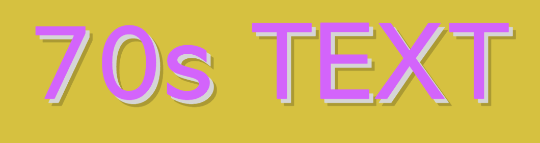
One of our favorite ways to play around with CSS is to apply cool effects to text. Text-shadows are a great, versatile tool to employ if you’re looking to apply cool effects to text, as you’ll see in the following snippet. Using CSS text-shadows, it’s easy to create a retro text effect that’s reminiscent of 1970s style and aesthetics. Check out the code below to use it for your own projects.

Join us in our newest publication:
h1 {
 font-family: "Avant Garde", Avantgarde, "Century Gothic", CenturyGothic, "AppleGothic", sans-serif;
 font-size: 92px;
 padding: 80px 50px;
 text-align: center;
}
h1.retrotext {
 color: #d364fb;
 background-color: #d6c140;
 letter-spacing: .05em;
 text-shadow: 4px 4px 0px #d5d5d5, 7px 7px 0px rgba(0, 0, 0, 0.2);
}
As always, the code (colors, font-family, etc) are completely customizable to suit your project.