Tool tips are messages that appear when you hover your cursor over a word, hyperlink, image, icon, or any other element in a graphical user interface (GUI) or website.
Also called an “infotip” and sometimes written as “tooltip”, these useful messages appear in a hover box, usually to describe the feature your mouse is hovering over before you click it. Normally, these tool tips only appear on computers using a mouse, as mobile devices mostly do not have a cursor in their GUI.
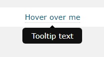
Here is an example of what a tool tip looks like:

(Image by Nikola Smolenski)
Traditionally, you can use simple HTML to create these tool tips, as in the example above. However, CSS tool tips will elevate the amount of support that you can provide your visitors.
With basic HTML, the tool tips appear automatically with no animations and no positioning. Using CSS, you have control over what they look like, where they’re positioned, and even whether they will have an arrow pointing to the element or not. In the example below, we have programmed the tool tip to appear below the sample text, with a black background, and an arrow pointing up.

Basic Tool Tip
As with most CSS tricks, you will need to define things in both the style sheet (external or within the web page) as well as within the body of the web page.
Here is a sample piece of code for a basic tool tip:
<style>

/* Tooltip container */

.tooltip {

position: relative;

display: inline-block;

border-bottom: 1px dotted black; /* If you want dots under the hoverable text */

}

/* Tooltip text */

.tooltip .tooltiptext {

visibility: hidden;

width: 120px;

background-color: black;

color: #fff;

text-align: center;

padding: 5px 0;

border-radius: 6px;

/* Position the tooltip text - see examples below! */

position: absolute;

z-index: 1;

}

/* Show the tooltip text when you mouse over the tooltip container */

.tooltip:hover .tooltiptext {

visibility: visible;

}

</style>

<div class="tooltip">Hover over me

<span class="tooltiptext">Tooltip text</span>

</div>
In the above example, there are two parts at play – the HTML part and the CSS part.
For the HTML portion, you need to create a container element such as <div> and then add a class to it, in this case we used “tooltip”.
Separately, the tool tip in itself is within an inline element (<span> in this example, with class “tooltiptext”).
For the CSS portion, the classes you have specified in HTML are defined here. In this example, the tooltip class uses position:relative (which you can change to position:absolute to define where the tool tip would appear).
We have also used the CSS3 border-radius property to make the corners rounded, creating a nice smooth border.
Lastly, the :hover selector tells the web page to show the tool tip when your mouse hovers over the <div class=”tooltip”>.
Positioning the Tool Tips
It’s easy to move the tool tip’s position using CSS, to the left or right, or to the top and bottom. All you need to do is define them like in the example codes below:
Positioned Right
.tooltip .tooltiptext {

top: -5px;

left: 105%;

}
Positioned Left
.tooltip .tooltiptext {

top: -5px;

right: 105%;

}
Positioned at the Top
Use margin-left by defining half of the tool tip’s width to center the tool tip. In this example, half of 120px is 60, so margin-left is -60px.
.tooltip .tooltiptext {

width: 120px;

bottom: 100%;

left: 50%;

margin-left: -60px;

}
Positioned at the Bottom
You can center the tool tip in the same manner as positioning tool tips at the top.
.tooltip .tooltiptext {

width: 120px;

top: 100%;

left: 50%;

margin-left: -60px;

}
There are many other cool things you can incorporate into a tool tip, all of which draw more attention and improve user experience in a way that basic HTML can’t. Once you learn other elements like borders and animation (using transition and opacity), you’ll be able to make your tool tips even more attractive. So have fun with it and keep learning!
