
CSS3’s justify-content property is a really useful way to make space around the items within an element that has been defined as a flexible container. Basically, it tells the elements within the flex container how much space should appear between them and the flexbox/the other items within the container. The default value is flex-start, which tells the elements to start at the beginning of the container.
Here are the other values that justify-content takes:
- flex-end: to position elements at the end of the container
- center: to position elements in the center of the container
- space-between: to position elements with space between the borders
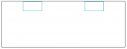
- space-around: to position elements with space all around (before, after, and between) the borders
If you plan on using flexbox as a CSS tool (which is highly recommended – it’s very dynamic in creating responsive layouts and grids), it’s definitely important that you also understand how to use it properly. Check out the code below to see it in action:
- .main-div{
- width: 400px;
- height: 150px;
- border: 1px solid #000;
- display: flex;
- justify-content: space-around;
- }
- .element{
- width: 60px;
- height: 30px;
- border: 1px solid #0096aa;
- }
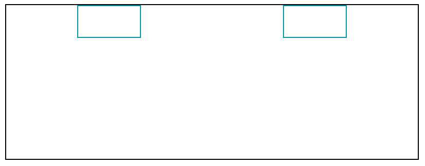
As you can see, justify-content: space-around adds space all around the two elements within the flexbox div to add a sense of positioning to the elements.