
CSS3’s column-count property makes it unbelievable easy to create completely responsive columns without adding any extra markup to your HTML. Check out the paragraph below and see how easy it is to turn one block of text into 2 separate columns.
Here’s how the code should look:
- div{
- column-count: 2;
- }
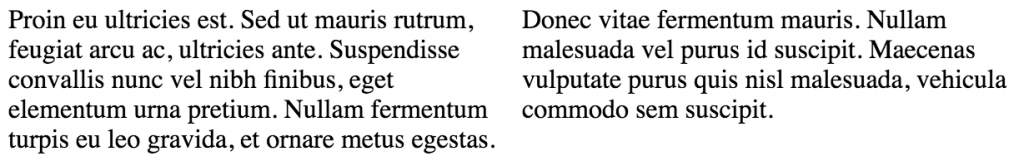
There are also some other CSS column properties that you can use to style your column-count columns, including column-width and column-gap. Column-width, naturally, defines the width of the columns you’ve dynamically created, while column-gap defines the space between the columns (this spacing is uniform no matter how many columns you decide to create). These properties don’t absolutely have to be defined, however, because they both have default values that will probably work well in most situations (see image above — these columns have default width and gap values).