What is Flexbox?
The Flexbox layout has changed the whole building process of website design by adapting the design for different devices with different screen sizes. Use of the Flexbox layout ensures that elements behave predictably when the page layout must accommodate different screen sizes and different display devices. Its potential makes it an ideal choice for small and large scale applications.
Responsive UI design and accommodating UI in different screen sizes is pretty painful and the process can be cringe-worthy. Fortunately, the Flexbox layout does the job without any fuss. It efficiently makes use of available screen space to properly arrange the elements by manipulating width, height and order. The Flexbox layout puts the elements inside a container, arranges them, aligns them and distributes space along a single column or row, regardless of it’s size. This allows elements to stretch or shrink inside the container based on the available screen size. You can align elements either horizontally or vertically. In other words, it’s the best choice for creating flexible and responsive design. Here is a list of 15 awesome CSS frameworks based on the Flexbox layout to help you build modern, responsive and flexible website design for all devices and modern browsers. In this list, some of the frameworks are ready to use, just include the framework and you are all set! Enjoy…
1. Bulma
Bulma is a modern, responsive and modular CSS framework based on Flexbox. Flexbox is a layout technique for aligning and distributing space for items in a container where the size of items is unknown or dynamic. The primary feature of the flex container is the ability to change the width/height of items to accommodate them in the best possible given the space available. It is modular and it provides options to import what you need. It consists of 29 SASS files that you can import individually. Bulma works well with all modern browsers except IE. IE 10+ is only partially supported by this framework.
2. Wire
Wire is a simple and lightweight SASS-based framework. The guiding principle of Wire is simplicity and avoiding unnecessary styles. It only styles a basic HTML element and includes a Flexbox grid and a set of mix-ins/helpers to make daily work easier and faster. Wire is written in Sass, a powerful CSS pre-processor. It can be used with classes in HTML or mix-ins in your Sass with your own classes which makes it fully customizable.
3. Juiced
Juiced is a flexible CSS front-end framework built on the Flexible Boxes Layout specification and has many improvements over the existing grid-based CSS frameworks. Juiced has some of the awesome things found in Foundation and Bootstrap, but it does not come with heavy styling, opinions, or a large codebase.
It has similar features that you may find with other Flexbox CSS frameworks, but it improves upon them with better mobile targeting, custom column ordering, better alignment options, understandable HTML, and fewer boilerplate styles.
4. Spectre CSS
https://picturepan2.github.io/spectre/index.html
Spectre.css is a lightweight, Flexbox based, responsive and modern CSS framework for faster and extendable development. Spectre provides basic styles for typography and elements, a Flexbox based responsive layout system, CSS components and utilities with best practice coding and consistent design language. It can also be modified for your project with LESS compiler. Spectre only includes modern base styles.
5. Reflex
https://github.com/leejordan/reflex
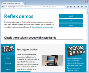
Reflex is a lightweight, responsive Flexbox grid with cross-browser support, an inline-block fallback and no dependency on polyfills. Polyfills is a browser fallback (made in JavaScript) that allows functionality you expect to work in modern browsers to work in older browsers. You can read more here about polyfills. Reflex is an ideal choice for creating complex nested grids based on Flexbox layout properties. It features:
- A lightweight package – 12KB when minified and only 1.8KB when gzipped.
- Grid cells of equal height by default
- Reflex grid cells that never push each other out of the way (as with floated grids)
- Support for semantic elements
- Support for nested grids
- Built-in Sass/SCSS and LESS
- BEM syntax
- Easy customization and extendability
6. Miligram
Milligram provides a minimal-style setup for a fast and clean starting point. Just 2kb gzipped! Specially designed for better performance and higher productivity with fewer properties to reset, Milligram results in cleaner code. Milligram is meant for modern applications. The grid system is based on Flexbox, sizes and lengths use the rem unit. Milligram officially supports the newest versions of Chrome, Firefox, IE, Safari, and Opera.
7. Basis
Basis is a lightweight, mobile first and responsive Sass/CSS framework based on Flexbox. The CSS architecture is based on FLOCSS which gives it a modular approach. It also incorporates the concept of vertical rhythm which provides a well-balanced design. Basis is very lightweight and comes with minimum styling. It comes with a basic set of components to speed up the web design process and you can always overwrite with your Sass/CSS.
8. Kube
Kube is a CSS-powered framework for creating modern, fast, and lightweight designs. It comes with 4px vertical grid-based horizontal rhythm, well-crafted typography, is equipped with the latest and greatest tech for creating responsive design, and Flexbox-based adaptive grid systems and support for all modern desktop and mobile browsers. It doesn’t impose its own styles and doesn’t require following any specific design rules or practices.
9. Thimble
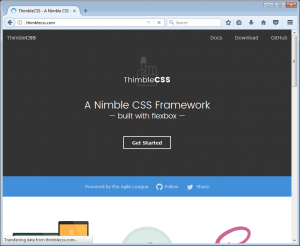
Thimble CSS is a nimble CSS framework built with Flexbox for the modern web. It’s designed to have a small footprint and clean code. It is a light, responsive, open-source and SASS-ready Flexbox CSS framework. It supports:
- Unlimited columns – add as many column elements you want and watch as they scale effortlessly!
- Easy content re-ordering
- The ability to vertically and horizontally center anything without absolute positioning or table layouts
- Keeping your columns equal height with fluid content
- Responsive header sizes
- SASS compatibility
10. ChuckCSS
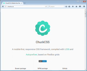
Chuck CSS is a flexible, adaptive, responsive, and mobile-first CSS framework compiled with LESS and Autoprefixer, based on Flexbox grids. It includes plenty of features like Flexbox grids, precisely crafted typography, beautifully designed buttons, alerts and modal windows. It is also compatible with FontAwesome and Ionicons font libraries.
11. BEMSkel
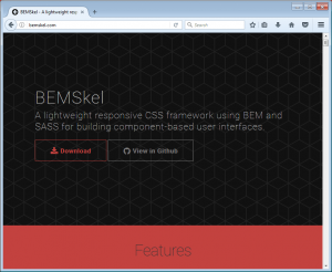
BEMSkel – short for BEM Skeleton – is a lightweight CSS framework using BEM and SASS. It’s designed to provide a solid foundation for building component-based web applications and user interfaces. It is written using the BEM (Block, Element, Modifier) naming convention to provide a consistent and strict naming convention which allows you to divide your user interface into independent blocks and allow reuse of existing code.
It provides styles for the most commonly used elements such as text, buttons, tables, and forms. It also includes two ways of creating grid systems: grid and Flexbox. As a simple rule, use grid if you need to support older browsers or Flexbox if you only want to support most modern browsers.
12. ShapeCSS
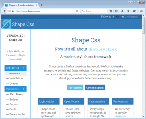
Shape CSS is a modern Flexbox-based CSS framework to make interactive, stylish and speedy websites. It is actively maintained to improve the performance and add new components to increase the overall website development process. It is very tiny and lightweight. The best part is, every single component is in single file! You can customize anywhere you want by overriding the class name or directly on the file.
13. Tent CSS
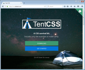
Sleeping in a tent is certainly not a luxurious experience! It is rugged and rudimentary, but it provides the basic necessities needed for survival. That’s exactly what Tent CSS framework does. Pulling inspiration from outdoor survival, Tent CSS is unglamorously simple, modern and robust. The framework is designed to be used as a foundation for building websites. On Tent CSS there are no fancy components like tab drawers, accordions, and carousels. It is:
- Featherweight – Less than 5KB in size when gzipped
- Modular – Includes only the necessary building blocks to create many of the most common UX design patterns
- BEM-based – It is developed with the BEM methodology in mind. BEM promotes component modularity, code reusability, and a rock solid code structure
14. BobScss
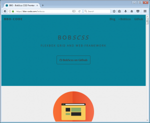
BobScss is Flexbox-based CSS framework to build fully responsive and mobile-first website designs. It is a lightweight compilation of basic styles and utilities. The framework places the emphasis on speed and performance. It scales perfectly on every device, from phones to tablets to desktops without hassle.
15. CSSPlus
http://hictech.github.io/cssPlusWebsite/home.html
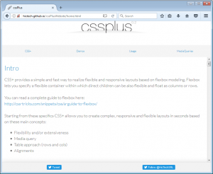
CSS+ provides a simple and fast way to realize flexible and responsive layouts based on Flexbox modelling. Flexbox lets you specify a flexible container within which direct children can be also flexible and float as columns or rows. CSS+ allows you to create complex, responsive, and flexible layouts in seconds based on these main concepts:
- Flexibility and/or extensiveness
- Media query
- Table approach (rows and columns)
- Alignments
Conclusion
Flexbox layout is a promising way of creating a website design. Plus you should consider using CSS reset for better Flexbox and CSS grid for a responsive layout. As it gives complete peace of mind while creating a flexible and responsive design. This post gives you an insight into some awesome Flexbox-based CSS frameworks that you can start using right away. These frameworks are modern, lightweight, modular, responsive, and cross-browser compatible. You should be careful while selecting the right Flexbox-based CSS framework. Your selection should be based on parameters like framework size, performance, cross browser compatibility, ease of use, and whether it is actively maintained or not.

