
CSS is a stylesheet language that developers use to develop layouts and design web pages. As a toolbox, we can use it to customize the orientation of various elements. If you work as a front-end developer, you’ll almost probably use the CSS gap property on a regular basis. So, you’ve probably heard of CSS’s gap property, but if you haven’t, we’ll explain what it is.
What is the gap property in CSS?
“Gap” is a shorthand for setting row-gap (vertical gap) and column-gap (horizontal gap) in a single statement. It takes the place of our default grid system’s horizontal padding and behaves more like a margin.
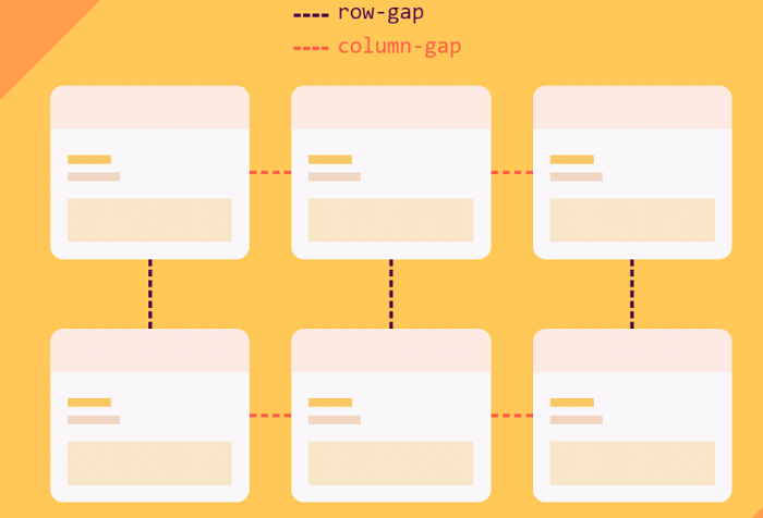
The gap CSS property determines how much space there is between rows and columns. If you’re not sure what the difference between gap property and grid-gap is, don’t worry; they’re pretty much the same thing. Grid-gap was the previous name for the gap attribute. Now that there are two additional layouts with a gap, we’ll refer to it as the gap property.
See Also: Easily Create Responsive Columns with Column-Count
Values of Gap Property in CSS
- Initial-This value represents the original value of the property.
- Normal-It’s used to restore the default value of the gap attribute. Grid-gap is set to 0 by default.
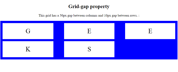
- Length-The spacing is specified in terms of length units, such as rm, px, and so forth. Consider the following case: 10 px x 20 px
- Percentage-The spacing can also be expressed in percentage units. For instance, let’s say the gap is 50%.
- Inherit-Represents the element’s parent’s calculated value for the property.
- Unset-Depending on whether the property is inherited or not, this value functions as either inherit or initial.
See Also: Creating a Two Column Fixed Width CSS Layout
Gap Property-Layouts
The gap is a design feature that we can use in the grid, flex, and multi-column layouts.
1. Grid Layout
It’s a quick and easy method to configure the grid gutters without having to type out each property name separately. We may also need to add gaps between rows and columns in a grid arrangement. So, depending on your preferences, you may use the grip-row-gap or grid-column-gap attributes.
2. Flex Layout
The gap feature turns out to be useful in flex layout as well, and it addresses a lot of issues. Some browsers, however, still don’t support the gap attribute when utilizing the flex layout. In this case, we can employ the gap property to generate space between cells.
3. Multi-column Layout
In a multi-column layout, the gap property functions similarly to a column gap. Because we employ Grid and Flexbox, the Multi-column Layout standard is sometimes disregarded. However, we may set column and row gaps separately and have them have different sizes from one another in this component.
See Also: How to Use CSS’s Clip Property
How to use Gap Property in CSS?
We can define the gap value in any acceptable CSS length format, including px, em, rem, cm, and so on. It’s also possible to specify it in percentages (per cent). You may also furnish the gap size with the calc() function.
Depending on the rows and columns, you can specify one or two values for the gap attribute. Grid-row-gap and grid-column-gap will be the same if just one value is specified. If there are two numbers, the first is for row gap and the second is for column gap.
- The column-gap CSS property specifies the width of the space (gutter) between the columns of an element. It has a value of 0 by default.
- In a grid layout, the row-gap CSS property determines the size of the space between rows. It also has a default value of 0.
See Also: How to Use CSS’s Backface-Visibility Property
Conclusion
The gap property in the grid, multi-column, and flexbox layouts can now manage the majority of website requirements. If you arrange all of the gap values together, you can program more efficiently. However, when defining a gap, you must offer two things: the layout property to which you want to apply the gap and the gap’s specifications.
Nevertheless, bear in mind that certain attributes and layouts differ between browsers when using shortened properties. Setting a gap property with CSS is not difficult, but it does take some prior knowledge of layouts and adjustments. In some browsers, other layouts may operate differently. As a result, testing your site across a number of browsers is critical.