
The text-stroke property is an experimental property that provides text decoration options. It is an abbreviation for the following characteristics:
- text-stroke-width
- text-stroke-color
The text-fill-color property overrides the color property, allowing for a graceful fallback to a different text color in browsers that don’t support the text-stroke property.
Web fonts are usually based on vector graphics, which means that the shape is determined by math and points rather than pixel data. Because they are vectors, we can do anything that other vector programs can do with vector text, and we can, for example, add a stroke to certain characters.
Web fonts are basically vector-based graphics. As a result, you can showcase them at 12px or 120px, and they will still be crisp and relatively sharp-edged. Vector denotes that points and mathematics determine their shape rather than actual pixel data. Because they are vectors, it would make sense if we could do things with them that other vector programs (such as Adobe Illustrator) can, such as draw a stroke around the individual characters. We can, after all!
The text-stroke property is only used when the vendor prefix is -WebKit-. This is a non-standard property. It is not suitable for all users. Incompatibilities exist between implementations, and behavior may change in the future.
See Also: How To Change Text Color In CSS
Simulation
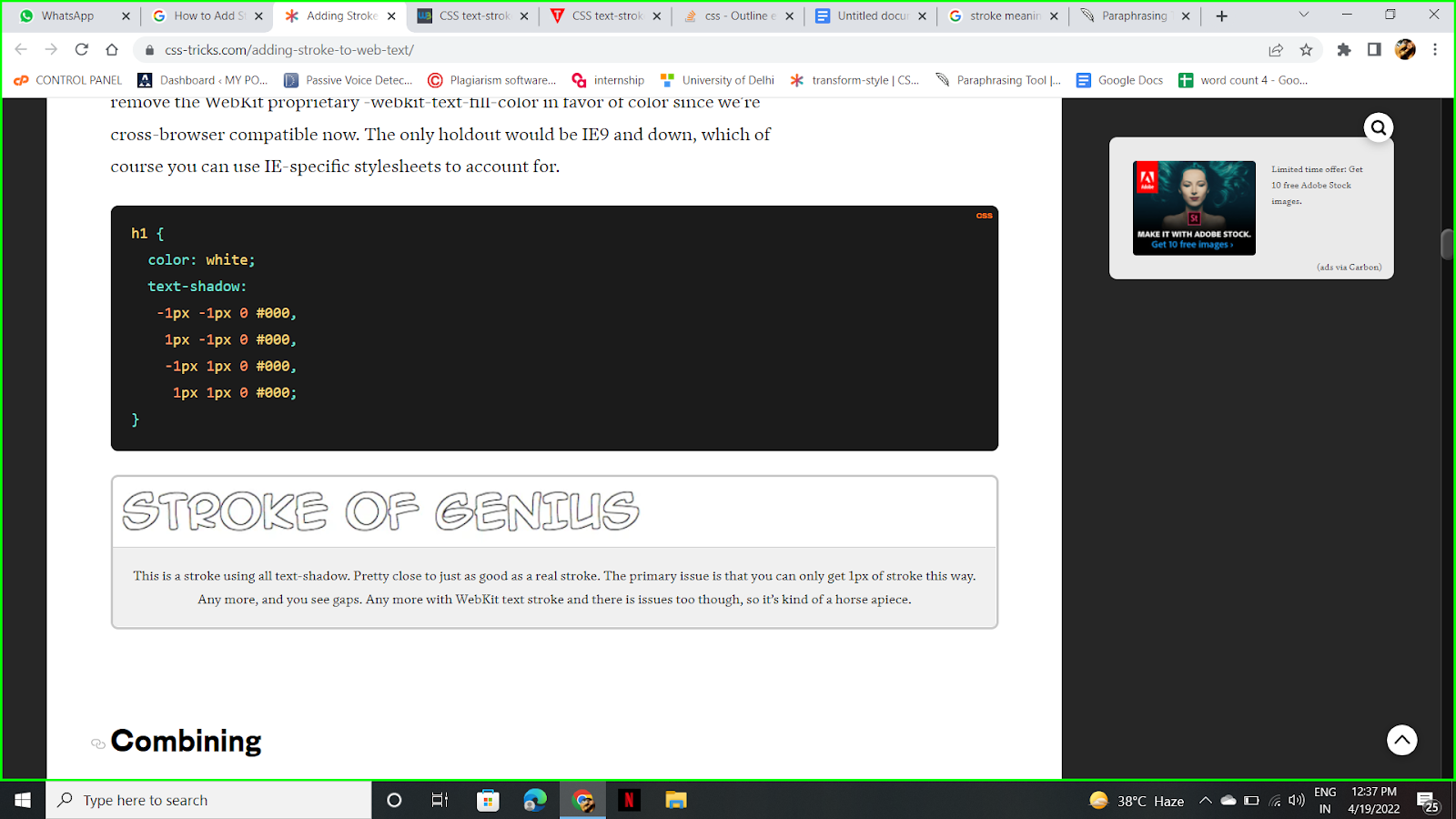
We can take this a step further by not entirely relying on the WebKit proprietary. We can simulate a stroke by using the text-shadow property (which is also supported by Firefox, Opera, and Internet Explorer 10).
We’ll use four shadows, one to the top right, one to the top left, one to the bottom left, and one to the bottom right, each with a 1px offset of black and no spread. Since we’re now cross-browser compatible, we’ll remove the WebKit proprietary -WebKit-text-fill-color in favor of color. The only exception would be Internet Explorer 9 and below, which can be accommodated with IE-specific stylesheets.

See Also: How To Center Text In CSS?
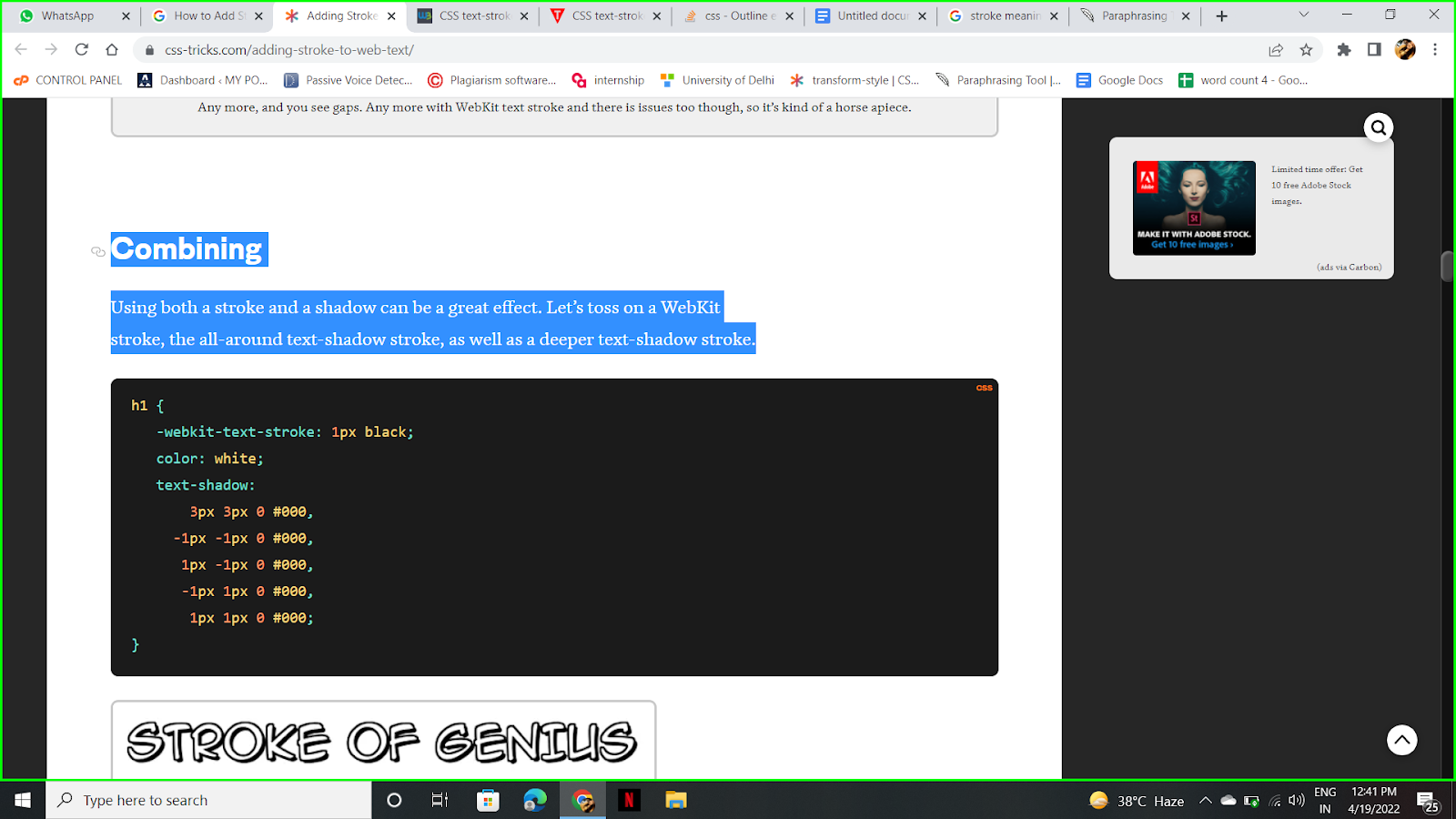
Combining
A Stroke and a shadow can produce a stunning effect together. Let’s add a WebKit stroke, as well as an all-around text-shadow stroke and a deeper text-shadow stroke.
Alignment
If you’re familiar with Adobe Illustrator, you might know that you can align a stroke on the inside, outside, or center of a shape. In the palette, that option looks like this:
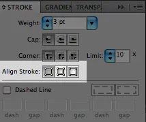
Text in Illustrator can be set to center stroke alignment only. However, once the text is expanded into regular vector paths, all three options become available. In the Appearance panel, add a new stroke and move it below your text (basically mimics outside stroke alignment).
Only the outside text stroke alignment looks good to me. It’s unfortunate that the unchangeable default for both CSS and Illustrator is centered. Simply don’t go overboard with the thickness of your stroke border, and you should be fine. Note that the text-shadow-only solution does not have this issue, but it also cannot stroke more than 1px.
See Also: Stylish Focus Effect on Input Text Using CSS
Values
- Length: This parameter specifies the thickness of the stroke.
- Color: Defines the stroke’s colour. Color names, hexadecimal colour codes, rgb(), rgba(), hsl(), hsla(), and other functions can be used.
For the record, you can use any color value for the stroke color (hex, RGB, hsla, keyword). That means you can have transparent strokes if you want, and they will “stack” in the sense that if strokes overlap each other (which is common), they will be darker.
- Initial: Sets the property’s default value.
- Inherit: This element inherits the property from its parents.
Text can also be used in other ways by vector-based graphics programs. You can squish or stretch the letters horizontally or vertically. This kind of text treatment is almost universally frowned upon, so it’s not a big deal that we can’t do it. Type can also be set on an irregular line. It would be awesome to do this with web text, and we could make text follow the border path of its parent element.
In Illustrator, we can also instruct a stroke to handle sharp corners in one of three ways: rounded, beveled, or mitered. These can have nice effects, but they are not available on the web. However, WebKit’s corner handling is quite good by default and arguably better than any of Illustrator’s options.
See Also: Use CSS to Add Various Shadows to Text and Elements