
We’ve already learned how to use CSS to create a diagonal split text effect on this site, so now we’re going to show you how to do the same effect horizontally. This is one of those effects that looks like it might be difficult or complicated to create, but the code is actually super straightforward. The best part about it is that it’s not one of those text effects tutorials where it doesn’t work or spacing and margins needs to be changed if you change the text used in the tutorial. This code works with just about any text you could possibly write, so feel free to use it for your own projects.
The HTML
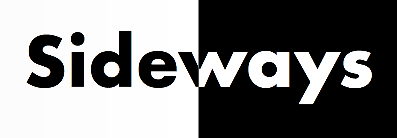
To start, we need some HTML. This is where we define what our text is going to say. Take a look at the snippet below to see how it should look — it’s a little different from your typical text tag.
<h1 data-heading="Sideways">Sideways</h1>
As you can see, we gave our <h1> tag an attribute called “data-heading,” with a value that exactly matches the text within the tag. This is super important. If you don’t remember to add this attribute, or to make the text in the attribute match your actual text, then the effect won’t happen and you’ll end up with some super confused looking text.
The CSS
This effect takes surprisingly little CSS to achieve. All we really need is some code that splits the background-color in half (half white and half black, in this case) which we achieve using the linear-gradient property, some code that styles the actual text (positioning, color, font-family, etc), and — here’s where the magic happens — some code that uses the :before pseudo-selector and the data-heading attribute to create an extra layer of text on the half of the screen that has a white background. This is going to be the text that’s colored black, while the text that’s colored white and on the right half of the screen is the text from the actual <h1> tag.
Take a look at the code below to see it more clearly.
h1 {
 font-family: "Futura";
 font-size: 9vw;
 top: 50%;
 left: 50%;
 margin: 0;
 transform: translate(-50%, -50%);
 position: absolute;
 color: #fff;
 white-space: nowrap;
}
h1:before {
 content: attr(data-heading);
 overflow: hidden;
 position: absolute;
 left: 0;
 top: 0;
 width: 50%;
 color: #000;
 }
Now your HTML should look like this:

Now that you know the basics of creating this effect, don’t be afraid to get creative with your colors, fonts, background-colors…the world is your oyster and this CSS tutorial is a perfect one to customize, because the code is so straightforward that customizations are actually quite simple.