Introduction
In the dynamic world of web development, the concept of responsive web design has become a cornerstone. As the variety of devices accessing the internet grows, from smartphones to large desktop monitors, the need for websites to adapt seamlessly has never been more critical. This is where CSS media queries play a pivotal role, allowing developers to create flexible and responsive designs that cater to a multitude of screen sizes and resolutions.
Section 1: Understanding Responsive Design
Responsive web design is the practice of creating web pages that adapt to the size and orientation of the user’s device. This approach ensures an optimal viewing experience, minimizing the need for resizing, panning, and scrolling.
The evolution from fixed-width layouts to fluid grids marked a significant shift in web design, emphasizing adaptability and user experience. In a world where internet access is increasingly mobile, responsive design is not just a trend; it’s an essential approach to web development.
Section 2: Basics of CSS Media Queries
CSS media queries are a powerful feature in CSS3, providing the ability to apply and alter CSS styles based on specific conditions or media types, such as screen size, resolution, and device orientation. Essentially, they act as a conditional statement in CSS, where styles are applied only when certain conditions are met. This capability is the cornerstone of responsive web design, allowing developers to tailor the presentation of content to different devices without altering the content itself.
The basic syntax of a media query involves specifying a media type, such as screen, print, or all, and one or more expressions that check for the conditions of particular media features. These features include aspects like width, height, resolution, and orientation of the viewport. The structure of a media query can be understood as follows:
@media [media type] and ([media feature]) {
/* CSS rules */
}
For example, to apply styles to a web-page when viewed on a screen (like a monitor or a smartphone) that is 600 pixels or narrower, the media query would be:
@media screen and (max-width: 600px) {
body {
background-color: lightblue;
}
}
In this example, the max-width: 600px is the media feature expression. It checks if the view port’s width is 600 pixels or less. If the condition is true, the body of the web-page will have a light blue background. This approach allows for designing versatile layouts that adapt to the screen size, enhancing the user experience across different devices.
Media queries can be combined in various ways to create more complex conditions. For instance, you can write a media query that applies styles when the viewport is between a certain width range or when the device is in landscape orientation.
This flexibility makes media queries an indispensable tool in the modern web developer’s toolkit, enabling the creation of responsive designs that are both functional and aesthetically pleasing across a wide range of devices.
Section 3: Implementing Responsive Layouts with Media Queries
When designing responsive layouts, it’s crucial to decide whether to adopt a mobile-first or desktop-first approach. Mobile-first design starts with styling for smaller screens, then progressively adds more features for larger screens. This approach is often more efficient, as it focuses on essential content first.
Using media queries, developers can create flexible grid layouts that adapt to the screen size. For instance, a three-column layout on a desktop can transform into a single-column layout on a mobile device. This adaptability ensures that content is readable and accessible regardless of the device used.
Section 4: Advanced Techniques and Best Practices
Advanced media query features like orientation (portrait or landscape) and aspect-ratio provide further control over how styles are applied. However, with these advanced features come common pitfalls, such as over-complicating styles or neglecting testing on actual devices.
Best practices for writing efficient and maintainable media queries include keeping them simple, using shorthand where possible, and organizing them logically within your CSS files. It’s also beneficial to use relative units like percentages or ems to ensure scalability.
Section 5: Testing and Debugging Responsive Designs
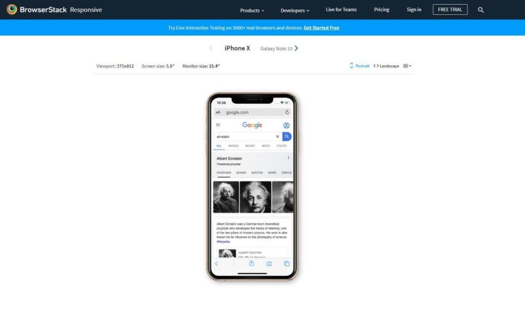
Testing is a critical phase in responsive web design. Tools like Browser Stack offer a platform to test how websites render on different devices and browsers, ensuring consistency and functionality. When debugging, developers should look out for common issues like unresponsive elements, text overlap, or images not scaling correctly.

Case Study: Little Solitaire
A practical example of effective responsive design is the online game littlesolitaire.com/ Developed by Australian programmer urban imp, this free online Spider Solitaire game showcases a fluid design that functions flawlessly across devices. On a desktop, the game utilizes a wide layout, while on mobile devices, it seamlessly switches to a more compact, single-column layout, ensuring an enjoyable gaming experience regardless of the device.
Conclusion
Responsive web design, powered by CSS media queries, is not just a technical requirement; it’s a commitment to user-centric design. By understanding and implementing responsive techniques, developers can create websites that offer a seamless experience across all devices.
Additional Resources
For those eager to dive deeper, resources like Mozilla Developer Network and CSS-Tricks offer comprehensive guides and examples. Additionally, experimenting with tools like Browser Stack can enhance your testing process, ensuring your designs stand up to the diverse landscape of web-enabled devices.
