

Adding a hover effect to any of your links or images can add much needed polishing to any project. One easy way to add this nice touch to your photos is by implementing a box-shadow effect that adds a subtle shadow to your images upon hover.
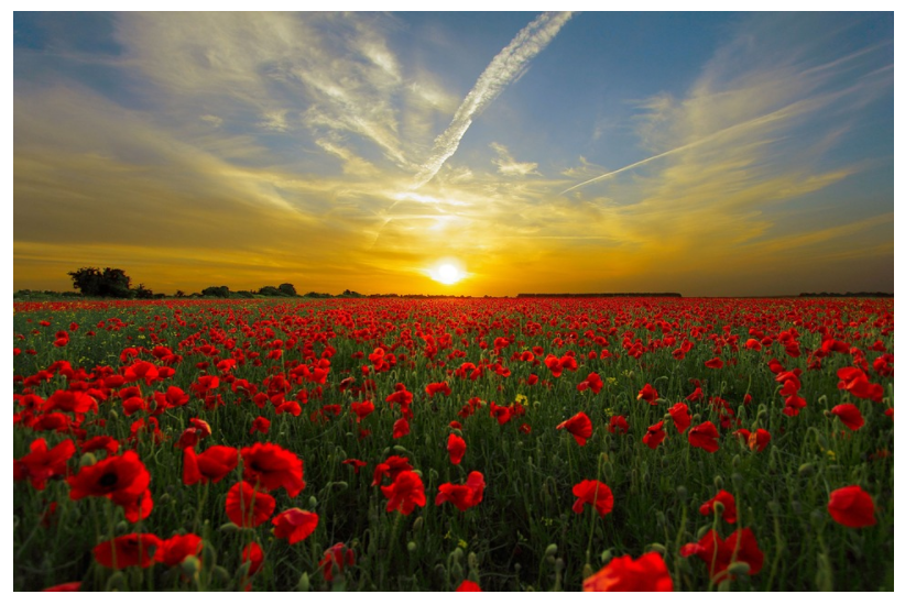
When you add this effect to your sites, you’ll take your regular images from looking like this:
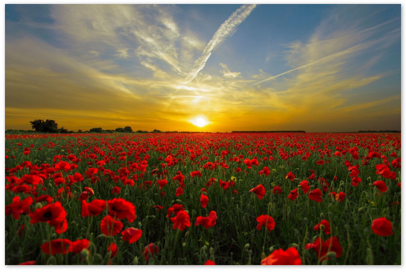
To looking like this, upon hover:
The difference is subtle but the effect of it is beautiful, soft, and sleek. Adding this hover effect to your images will definitely give your designs that extra something they may have been missing.
To see how to implement the effect for yourself, check out the code snippet below:
img:hover{
 -moz-box-shadow: 1px 1px 5px #999;
 -webkit-box-shadow: 1px 1px 5px #999;
 box-shadow: 1px 1px 5px #999;
 -webkit-transition: all .2s ease;
transition: all .2s ease;
}
To use this snippet for yourself, make sure you use vendor prefixes with the box-shadow property, as it’s not always supported by older versions of certain browsers.
We’ve also included an optional but very nice transition effect to make the appearance of the box-shadow on hover a little less jarring. To use the transition effect, you should also include the vendor prefixes. Feel free to change the time of the transition effects (the time is in seconds, so for our purposes we wanted the transition to last .2 seconds) to suit the needs of you and your project. The longer the transition effect, the smoother and softer the transition appears to be. Just don’t make it take too long, as users don’t typically hover over images for a very long period of time anyway.
To add this snippet to any of your projects, just copy and paste it into your CSS file, and be sure to replace the “img” selector with the class of the images you’d like to select, otherwise the effect will apply to all images on your site.