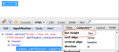

I recently ran into a bug in Firefox and Opera when I tried to set the line height of text inside a button (which affects input “submit” buttons as well as the HTML button tag). The bug? The line height can’t be changed!
For example, take the following code:
input#button {
	border: 2px solid #06f;
	color: #06f;
	background-color: #6cf;
	font: bold 12px Arial, Helvetica, sans-serif;
	line-height: 50px;
}
In a perfect world, this code would be a quick and easy way to vertically center text inside a button and set the button’s height, since text is always centered inside of the space created by its line-height.
But the results are inconsistent. Chrome, Safari, and (I can’t believe this either) Internet Explorer 8 all center the text and resize the button just like I’d expect. But the results are less than perfect in Firefox and Opera (see the image above).
The Problem, Defined
A quick look at Firebug proves enlightening: even though I’ve specified a line-height of 50px, Firefox is using a line-height of 15px instead.

So what gives?
It seems our bug isn’t really a bug at all, but a “feature”: that is, it’s a deliberate decision by Firefox to limit line heights on buttons. This is evidenced by this line of CSS in Firefox’s default CSS:
button, input[type="reset"], input[type="button"], input[type="submit"] {
	line-height:normal !important;
}
Basically, Firefox is setting the line-height to “normal” on buttons and is enforcing this decision with an !important declaration. This is a frustrating decision on their part, particularly considering (as Eric Meyer has pointed out at great and detailed length), line-height: normal is anything but.
And while trying to work around this rule, I discovered something that makes the situation a little more dire: browser-defined !important rules cannot be over-ruled by author-defined !important rules. This rule cannot be overruled by a CSS file, an inline style — anything.
So what’s to be done?
After a couple of hours of teeth-gnashing, I’ve settled on the following as an acceptable workaround. Instead of using line-height, use padding.
So to take the example from earlier, we’d convert it to look like this instead:
input#button {
	border: 2px solid #06f;
	color: #06f;
	background-color: #6cf;
	font: bold 12px Arial, Helvetica, sans-serif;
	padding: 18px 6px;
}
This effectively centers the text inside our buttons, but it isn’t ideal. It means there’s no easy way to ensure our buttons are using the same line-height as the rest of our content, and it means the size of the button can’t be dependent upon the size of the button text. But I’ll take what I can get on this one.
