The possibilities when it comes to coding have become diverse, incredibly trendy and very advanced. Tables, which were one of the first tools a developer had to create a grid, are still considered useful for certain things, despite the many ways that web development has evolved. It’s a way of storing and presenting data that is acceptable everywhere. It’s a useful way to organize information for your users. Another great use for tables is in email templates. It’s actually recommended to use tables exclusively because of the issues presented by sending content to so many types of email clients and devices. In this article we’ll go over styling tables with CSS for web development and for email marketing.
First, let’s look at a few different tables types and designs…
Basic Data Table
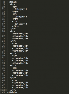
Displaying your data on a table is good for readers because it’s the easiest way to read a lot of information in one place. If you are still learning how to code, it might be a little confusing because, though writing code goes from left to right, up to down, coding for a table can get weird. It’s really good to keep in mind that coding tables are filled out by rows. Those rows are then filled in with data cells. Make sure to create separate sheets for HTML and CSS, and link to the CSS sheet on the HTML sheet in the <head> section. Here’s an example of the code that will create a straightforward table where you can organize data:
To copy and paste the code, follow this link: https://codepen.io/imrizzy/pen/ZKpoyL
And here’s the CSS code:
table, th, td {
	border: 1px solid black;
}
As the columns grow, you may have trouble reading the data because of the amount of information being displayed. It’s easier on the eyes to add background color to every other row by adding the following code to the main.css file:
tr:nth-child(2n) {
    background: lime;
}
As bland as tables might sound, you can always get creative with the little things. For example, adding cellpadding to each data cell. This allows for buffer space between the words and cell walls. Or, you can make the category names different colors, causing them to stand out from the rest of the table. That would make the categories more clear amongst all the other cells. You can play with border colors and thickness, or even highlight the entire row your cursor is hovering over in a different color using with the code below:
tr:hover {
    background: yellow;
}
If you want just the cell to be highlighted, then you can change the “tr” to “td”. Finally, of course, you can change the background color to your preferred hue!
Using Tables in Email Templates
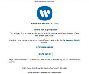
Creating email templates is not the easiest, considering you have to know what kind of information you want to present and exactly how you want it be formatted. Luckily, most of the web audience these days is on mobile. If this is true of your audience you have the option of just placing each section below the previous one, like building blocks. Here’s a Warner Music Group email that I coded onto my Codepen: https://codepen.io/imrizzy/pen/Lxqpje?editors=1000#0.
You’ll notice the CSS is in the HTML file in this example and that’s okay for email templates. It’s less complicated to have it all in one file. In fact, it’s protocol to have the stylings of each data cell be inline. This is the best way to work with email templates and most tables in general. Although, it’s not completely wrong to have them in separate sheets.
Conclusion
You may not consider tables to be the most exciting thing, but there’s definitely a lot of styling you can do if you know what your options are for attributes. It’s something worth exploring because tables are the most basic form of coding, and knowing the fundamentals is always key. Furthermore, if email template creation is a big part of your work, you will definitely want to use styling tables as this coding is accepted and understood by all mail clients. Happy coding!


