
If you are a front-end developer, the CSS border is something you will almost certainly utilize on a daily basis. CSS is a stylesheet language that developers use to design and layout web pages. It can be used to personalize the orientation of various elements as a toolbox. You have probably heard of beveled corners in CSS, but we will explain what they are if you have not. This article covers all you need to know about using CSS to create beveled corners and other CSS border tricks.
See Also: JavaScript and CSS tips for Beginners
What are Beveled Corners in CSS?
CSS border styles make your content stand out from the rest of your site’s content, or you can use them to emphasize something exceptional. On the other hand, the beveled border gives a gradation to your elements. It is basically two inner shadows: a light one from the top left corner and a dark one from the bottom right corner, which, when combined, provide a sense of depth.
This effect is certainly something you have seen on the internet. It is frequently used around photographs to give them a picture frame appearance. Using the border-style: outset property, you can easily create a bevel effect. However, this is not the only way to make beveled corners; we have compiled a list of additional CSS bevel border choices for you to consider.
See Also: Use CSS to Add Various Shadows to Text and Elements
CSS Border Tricks for Beveled Corners
1.Border-style:Outset Attribute
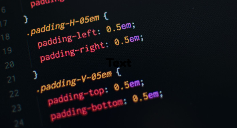
When you want all four borders to be the same, the border shorthand comes in handy. However, you may utilize the longhand border-width, border-style, and border-color parameters to differentiate them. We want to do the same thing with the beveled corners in CSS. You may also use the physical and logical border characteristics to target one boundary at a time.
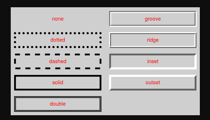
The outset border creates the illusion that the box is emerging from the canvas, which is known as the beveled effect. The “outset” value generates a 3D look that mostly depends on the border-color value. You can easily accomplish this by using two colors that are slightly brighter and darker than the border color to create a “shadow.”
See Also: 15 Awesome Flexbox CSS Frameworks
2.Box-Shadow Attribute
You can cast a drop shadow from the frame of practically any element using the box-shadow attribute. You simply need to describe a horizontal and vertical shadow in its most basic form. The developers can apply multiple effects to the comma-separated frame of the element. The X and Y offsets relative to the element, blur and spread radius, and the color is all used to characterize the box shadow.
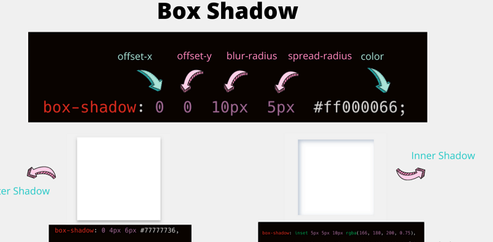
You may adjust the horizontal location of the shadow using the h-offset. The shadow on the right side of the box shows a positive value, while the shadow on the left side of the box depicts a negative value. You may also use the v-offset to select the vertical location of the shadow value. The shadow below the box shows a positive value, while the shadow above the box displays a negative value. This is how you can quickly add beveled corners to your CSS page.
See Also: 10 Beautiful CSS Text Effects
3.Border-Image Attribute
The border-image attribute is a convenience for the parameters border-image-source, border-image-slice, border-image-width, border-image-outset, and border-image-repeat. You may use this attribute to define an image that you can utilize as the element’s border. As a result, you may use this feature to add a beveled border to your elements as an image.
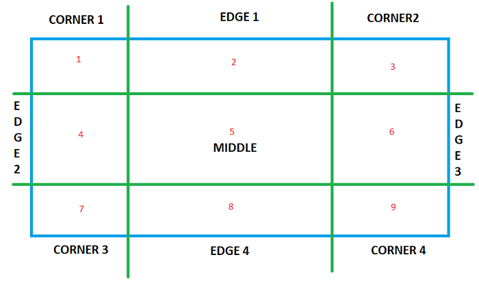
You can extend the border-image attribute to any element except internal table elements when the border-collapse displays as collapse. The border-image-source attribute specifies the source for the border-image. A URL, data URI, CSS gradient, or inline SVG are all used as image sources. Moreover, to create your border, you can use any sort of gradient.
Conclusion
It is not difficult to set a border property using CSS, but it does require some prior understanding of shapes and styles. Other border styles may behave differently in various browsers. Therefore, it is crucial to test your site in a variety of browsers. The essential thing to remember is to use the proper border setting, which is the second step in achieving the beveled effect.
See Also: Five Informative CSS Blogs All Designers Should Follow