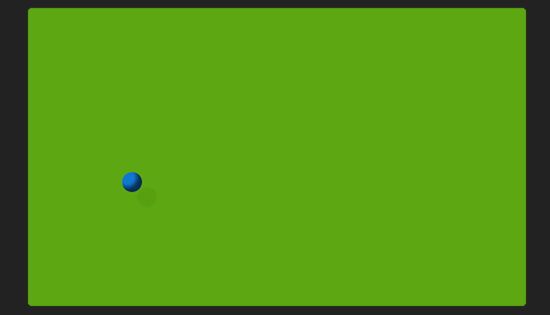

Today we’re going to create a ball that bounces infinitely around its container.
I’ll admit it: the idea for this tutorial was based on two things: first, those corny bouncing ball/logo/whatever screensaver animations that are so popular on modern televisions, DVD players, or just about anything else that has — or outputs to — a screen. Second, a brief but passionate love affair I had with Jezzball in 2001.
So if bouncing balls are so old-school, what’s the big whoop? We’ll do ours entirely with CSS.
The HTML
The HTML we need is pretty minimal: we need an element to be the ball, and we need a container for it to bounce around in. I’m keeping things short and sweet here:
Like in my sphere tutorial, I’m using the good ol’ <b> tag for the ball.
The Box CSS
There are three things we need to do here: style the box, style the ball, and animate the ball within the box. We’ll take them in that order.
First up, we’ll give our container some visual interest.
.box {
  background-color: #61ab20;
  margin: 0 auto;
  width: 500px;
  height: 300px;
  position: relative;
  box-shadow: inset 0 0 3px #000;
  border-radius: 5px;
  border: 1px solid #111;
  overflow: hidden;
}
Some of these styles are arbitrary: you can give it any background-color, margin, box-shadow, border, and border-radius you wish. The rest are more important. Our box needs a defined width and height. You can define that in whatever units you want, but it’d be a good idea to define the ball using the same units. And the relative position is critical, because that’s what will allow the ball to move around in its container. The hidden overflow is necessary to prevent any “extras” we add to the ball from showing up outside of the box.
The Ball CSS
Next, we’ll style the ball:
.box b {
  display: block;
  width: 20px;
  height: 20px;
  border-radius: 50%;
  background-color: #3673cf;
  box-shadow: inset -5px -5px 5px rgba(0,0,0,.6), 15px 15px 2px rgba(0,0,0,.04);
  position: absolute;
}
The absolute positioning is the most critical bit here: that’s what allows us to move the ball within its container. You’ll also notice a lot of similarities to how we created the sphere in the last tutorial. This is a slightly simplified version: I’ve rounded its corners and used an inset box-shadow to create a 3D effect, but at this small size I didn’t bother with any other tweaks. I did, however, add a second box-shadow, which you can see on this line:
box-shadow: inset -5px -5px 5px rgba(0,0,0,.6), 15px 15px 2px rgba(0,0,0,.04);
Some CSS3 properties accept multiple values, separated with a comma, and box-shadow is one of them. The first box-shadow, before the comma, is our shading. The second is a faint shadow to the bottom-right of the ball, which further suggests a light source to the top-left. And by moving the shadow 15 pixels away from the ball, it also gives our box the illusion of depth.
After all that, we’re left with something like this:

It’s not much to look at without the animation, so let’s move on.
The Animation Keyframes
To animate our ball, we’re going to use CSS keyframes. Keyframes allow us to animate any number of CSS properties over time. We’ll use two very simple keyframes to manage our mischief.
First, let’s create a keyframe to move our ball along the x-axis:
@-webkit-keyframes moveX {
  from { left: 0; } to { left: 480px; }
}
@-moz-keyframes moveX {
  from { left: 0; } to { left: 480px; }
}
@-o-keyframes moveX {
  from { left: 0; } to { left: 480px; }
}
@keyframes moveX {
  from { left: 0; } to { left: 480px; }
}
As you can see, this is really just the same keyframe repeated for each of the major browsers. Keyframes are a newer addition to CSS, so we’re stuck using vendor prefixes for the short term.
All this keyframe does is move our ball from the left side of the box to the right. Because ‘left’ positioning uses the left corner of the element to determine placement, our leftmost position is calculated as the width of the box, minus the width of the ball: 500px – 20px = 480px.
We can apply the animation to our ball by adding the following rules to the ball:
-webkit-animation: moveX 3s linear 0s infinite alternate;
-moz-animation: moveX 3s linear 0s infinite alternate;
-o-animation: moveX 3s linear 0s infinite alternate;
animation: moveX 3s linear 0s infinite alternate;
Again, we have one rule for each of the major browser prefixes. I’m using animation shorthand here, so I’ll walk through it. We’re saying to animate the ball using the moveX keyframe rules, it should take 3 seconds to complete the animation, we want linear easing (that is, don’t slow down (ease) at the ends of the animation), we want a 0 second starting delay, we want the animation to repeat infinitely, and we want it to alternate from front to back, instead of looping around to the beginning when it repeats.
Of course, that only gives us an animation along the x-axis. Now, we could easily just change the “top” values in addition to the “left” values in our existing keyframe. But there’s a problem with that. If we define the both in the same spot, the ball will always bounce from the top-left corner, to the bottom-right, and back. If that’s what you want or need, perfect. But I want some variety.
So instead, we’ll create a second keyframe to control our movement on the y-axis:
@-webkit-keyframes moveY {
  from { top: 0; } to { top: 280px; }
}
@-moz-keyframes moveY {
  from { top: 0; } to { top: 280px; }
}
@-o-keyframes moveY {
  from { top: 0; } to { top: 280px; }
}
@keyframes moveY {
  from { top: 0; } to { top: 280px; }
}
This is basically the same as our moveX keyframes: we’re moving the ball from the top of the box, to the bottom (minus the width of the ball).
Bring It All Together
And here’s where it gets interesting. Elements can have more than one keyframe animation applied to them at the same time, separated with a comma, just like box-shadow. And more interestingly, each animation can have a different timing value! So let’s change up our ball animation to look like this (I’m only showing one for brevity):
animation: moveX 3.05s linear 0s infinite alternate,
moveY 3.4s linear 0s infinite alternate;
moveX is still there, though I’ve tweaked the animation to take 3.05 seconds to complete. Then, after a comma, we have our moveY animation, which takes 3.4 seconds to complete.
Why the different times? It means that the animations will finish their loops at slightly different points. This makes the ball appear to bounce randomly about the container, seemingly never hitting the same spot. It does, of course – after 207.4 seconds in this example, according to math – but you can modify that frequency by changing the number of seconds the animations take.
Here’s the whole thing in action:
Give it a try in the demo, and modify the animation values to see how it effects the movement of the ball.
Note: As with almost everything awesome and CSS3, you’ll need a modern browser to make this work. You should be fine with the latest versions of Chrome, Safari, Firefox, and Opera. IE10+ on this one, as IE9 and below doesn’t understand keyframes.
