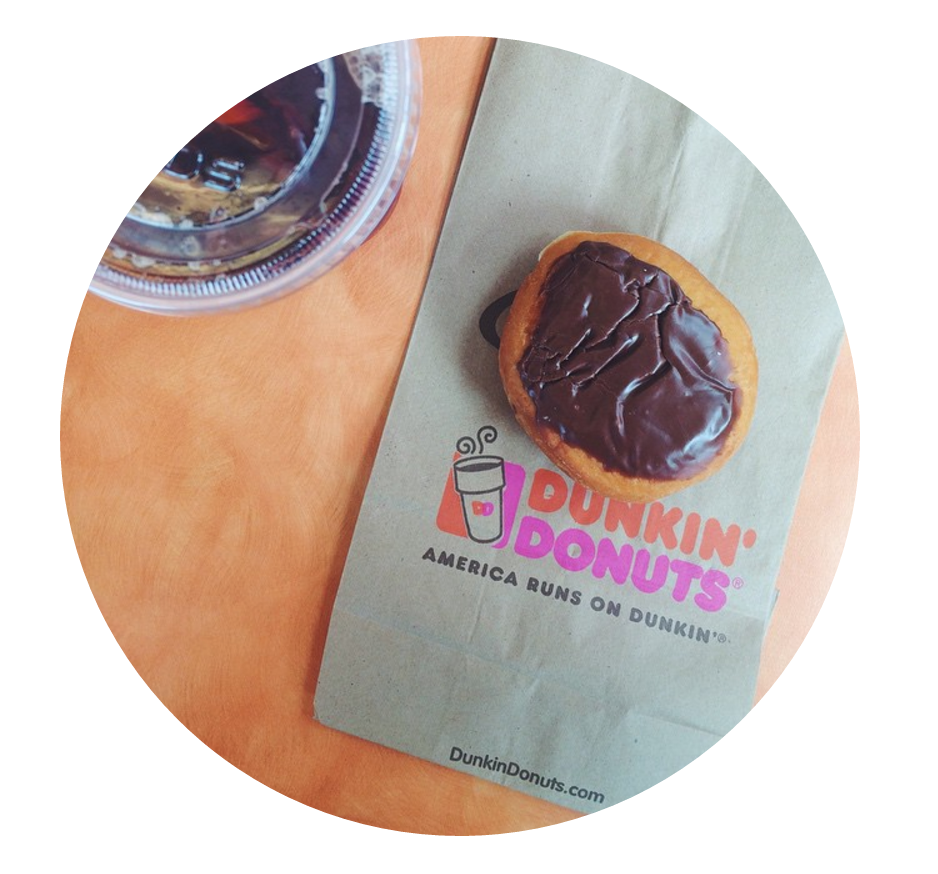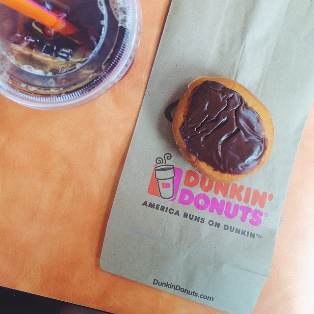
CSS3’s border-radius property is most commonly used to add rounded corners to elements that are otherwise square. It’s a great tool for adding some softness to your designs. Less commonly, the property is also used to turn square images into perfect circles (if you’re looking for a circle, your image has to be square, otherwise you’ll end up with some variation of an oval).

Join us in our newest publication:
If you start with the square image above and apply the following CSS to it, it becomes a perfect circle, as seen in the image below.
- img{
- border-radius: 100%;
- }

