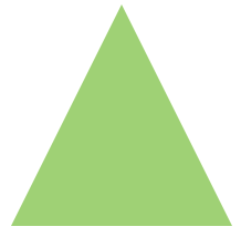
With CSS it’s super easy to create shapes out of pretty much any div. Some shapes are pretty straightforward to code, like squares and rectangles. Even circles are just squared with a border-radius set to 100%. Triangles, however, are a little more complicated to create. In order to make them, you have to manipulate the border property. For a triangle that points up, the border-left should be 50px solid transparent and the border-right should be the same — that will create the lines that come to a point. Then make sure the border-bottom is 100px solid #9fd175 (or whatever the color of your choice may be — also, the numbers are arbitrary: as long as the border-left and right px size is half of the border-bottom size, it should work to create a triangle shape). See the code below:
- .triangle{
- width: 0;
- height: 0;
- }
- .triangle.up{
- border-left: 50px solid transparent;
- border-right: 50px solid transparent;
- border-bottom: 100px solid #9fd175;
- }

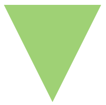
To create a triangle pointing down, the border properties will need to be tweaked a bit to make the point face downwards:
- .down{
- border-left: 50px solid transparent;
- border-right: 50px solid transparent;
- border-top: 100px solid #9fd175;
- }
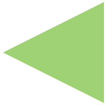
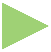
See the code below for code that will create triangles that point to the left or to the right:
- .left{
- border-top: 50px solid transparent;
- border-right: 100px solid #9fd175;
- border-bottom: 50px solid transparent;
- }
- .right{
- border-top: 50px solid transparent;
- border-left: 100px solid #9fd175;
- border-bottom: 50px solid transparent;
- }
Now that you’ve mastered creating triangles, use them to add some dimension to your next projects!
