One of the most useful properties of both unordered lists (which we fancied up earlier this week) and ordered lists is their ability to nest — that is, to contain lists within lists. And one of the most common examples of a nested ordered list in the real world (or at least, in my world) is an outline, be it a resume, a research paper, or something else entirely. But by default, the web doesn’t lend itself to really attractive or useful outlines… they tend to look something like this:
- First item
- Indented item
- Another indented item
- Indented triple!
- Not indented as much
As you can see, the browser doesn’t bother to vary the indentation style much, or change the list type from roman numerals to alphabetical characters and so on… all the things we’re so used to seeing because Microsoft Word and other writing programs do them by default. So let’s use a bit of CSS ingenuity to make a Microsoft Word-styled outline using ordered lists!
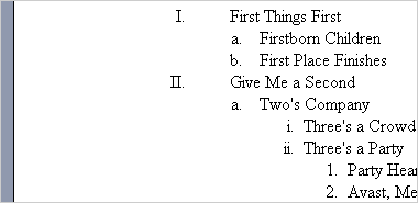
Before I started crafting this tutorial, I first took a look at what a default outline looks like when built in Microsoft Word 2003. Here’s a screenshot of that sample outline. This, my friends, is our goal.
The first step to building this outline in CSS is to properly nest your unordered list. It should look something like this:
<ol>
	<li>First Things First
		<ol>
			<li>Firstborn Children</li>
			<li>First Place Finishes</li>
		</ol>
	</li>
</ol>
As you can see from the code above, in order to properly nest lists, you need to place the sub-list inside of the list item you want it to be a subset of. So we’ve started an ordered list, opened our first list item, and then added an entirely complete ordered list to the mix before we close that list item.
Now that we know how to build the list, all we need is the CSS. For this, we’ll be using the list-style property along with a set of increasingly specific selectors for our rules. Our first rules look like this:
ol {
	list-style: upper-roman;
	margin-left: 2.25em;
	padding: 0; }
li {
	padding-left: 2em; }
These rules do a few things. The list-style property tells all of our ordered lists to use roman numerals instead of numbers. The margin and padding on the “ol” tag indents our list a respectable amount: specifically setting both margin and padding makes IE behave just like the other browsers, because IE indents lists using padding by default while all other browsers use margins. And last but not least, our padding-left on the list item adds some space between our roman numeral and the text, just like in our example outline from MS Word.
However, this CSS gets applied to all of our unordered lists, not just the first one. So we’ll need to use a set of increasingly specific selectors in our CSS to create the appropriate look. Here’s the full CSS for a complete four-level outline:
ol {
	list-style: upper-roman;
	margin-left: 2.25em;
	padding: 0; }
ol ol {
	list-style: lower-alpha;
	margin-left: 1.25em;}
ol ol ol {
	list-style: lower-roman;
	margin-left: 2.5em; }
ol ol ol ol {
	list-style: decimal; }
li {
	padding-left: 2em; }
li li {
	padding-left: .4em; }
li li li {
	padding-left: 0; }
Here, the “ol ol” rule means “only apply this style to ordered lists within ordered lists,” and “ol ol ol” does the same for third-level lists, and so on. As you can see, we’re setting the list style to lowercase alphabet on the 2nd level, lowercase roman numerals on the 3rd, and regular numbers on the 4th. We’re also adjusting the margin on the 2nd-4th levels of the list (and 2nd – 3rd levels of the list items) to make them more consistent with Word’s display. If you wanted to adjust them to something different, it’s a simple matter of changing the number of ems in the margins or padding.
After the 5th level, Microsoft Word simply cycles back through the same styles starting at the 2nd level, so if you wanted an outline more than four levels deep, you could just do something like this to save bytes and effort:
ol ol, ol ol ol ol ol {
	list-style: lower-alpha;
	margin-left: 1.25em;}
And that’s all there is to it! Here’s our completed example, complete with a little extra styling just for kicks to make it look more like Microsoft Word’s print layout (my editing layout of choice). If you’re interested, here’s the CSS I used for creating the print layout look:
body {
	background-color: #9099ae; }
#wrap {
	background-color: #fff;
	margin: 0 auto;
	width: 33em;
	border: 1px solid #000;
	border-right-width: 3px;
	border-bottom-width: 3px;
	padding: 5em 6em;
	font-family: "Times New Roman", Times, serif; }
And the best bit? This styling works pretty much everywhere: Firefox, Opera, Netscape, Safari, and even Internet Explorer 5.5 and up all behave themselves! (IE 5.5 ignores our “auto” margin in the print layout view, but it still gets the outline part right)
So now you can go out into the world, head held high, confident in your abilities to organize the myriad lists of the web into visually appealing outlines with wild, voracious abandon. You know… if that’s your sort of thing.
