In the past couple of years, CSS3 has made huge improvements and gained tremendous popularity. Most of the developers are including it in to their websites for better performance. Apart from the development of unique style,s CSS3 is now being used to develop interesting interface prototypes. CSS3 box shadows is an unique and power-packed feature of the language which can be used to make high impact designs which can be used in various browsers.
What Exactly is Box Shadow?
Box shadows are a property of CSS3 which can be used for the formation of shadow effects on arbitrary components used in the designing of a website. The box shadow is capable of taking the shape of the element with well defined borders. The basic box shadow is comprised of six different properties i.e. inset, left, top, blur, size, and color. Developers can also create a pop up or layering effect using the CSS3 box shadow effect. To do so use the multiple box shadow property or the text shadow property on the site’s elements. The first time the effect is used, it will appear on the top of the element. When the rest of the effects are applied, it will go on stacking up gradually giving the element a pop up or some pretty creative effects which depend on the various styles depending on how they are applied. When applying the CSS3 box shadow to an element, it will stop when it reaches the end of the element. This feature is particularly helpful when trying to create a shadow effect over a white or monochromatic background.
How Does It Work?
Box shadow commands usually need to be written in 2-4 length values with each separated by a comma. Various kinds of effects along with color schemes and inset effects can be created if desired. Just write down the various values which provide the horizontal effects, vertical effects and blur distance respectively and define the color of the shadow that is being dropped by writing a value write after the 2-4 length value.
The fact that these effects are compatible with most of the leading browsers, makes it even more easy to work with. Check out all the amazing effects using CSS3 Box Shadows and let us know which one is your favorite.
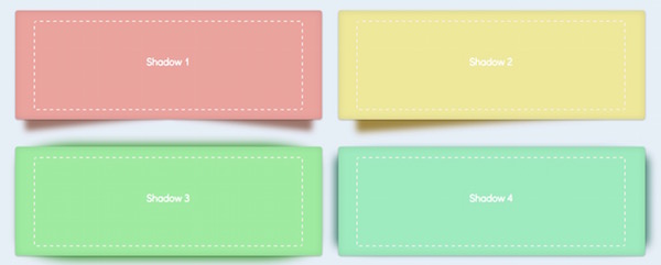
1. Shadow
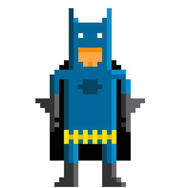
2. CCS3 Single Element Batman
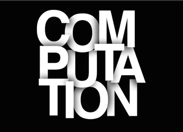
3. CSS Text Shadow
4. Rainbow Circle

5. Squishy Toggle Buttons

6. Apple Store Icon
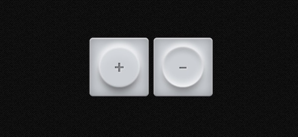
7. Animated Text

8. Nar Sang

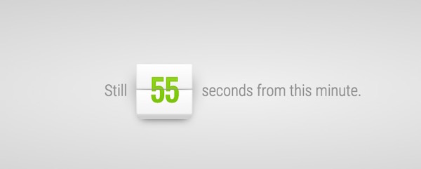
9. Seconds Counter
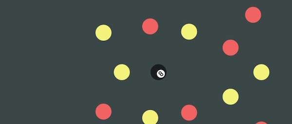
10. One Element, Multiple Shadwos
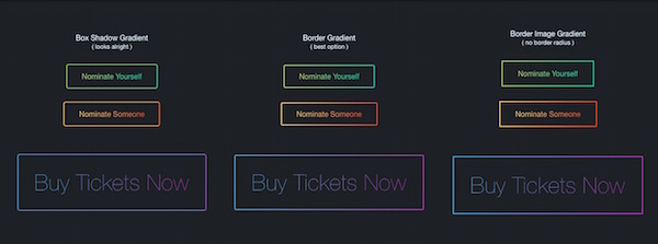
11. Gradient Ghost Buttons
12. Just Playing with ShadowPainter

