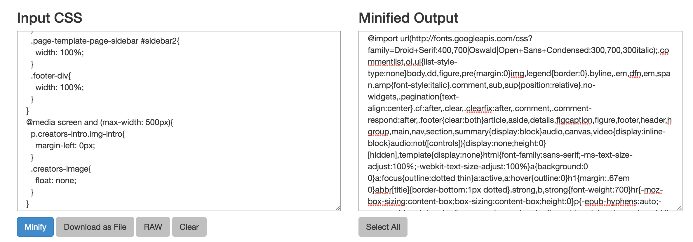
Media Queries: General Guidelines

Using media queries is a great way to optimize your sites for all different mobile viewports. When using media queries to make your site responsive and mobile friendly, it’s important to keep certain breaking points in mind. Use the media […]

Read Article

Using Pseudo-Selectors to Style Links

CSS3 allows for various different pseudo-selectors to be applied to anchor tags in order to style links at various different stages of use or activity. The pseudo-selectors that are often applied to links are:

:link – applies to links that have […]

Read Article

Tips for Flawless Responsive Design

1. Start with a clean design

There’s not a lot of space on mobile devices for inessential or complicated features. Starting off with a clean design will help your users to make sure they can clearly understand and navigate the content […]

Read Article

CSS3’s Embossed Text Effect

There are so many cool text effects that can be achieved using CSS3’s versatile text-shadow property. One easy text effect you can employ using this method is the embossed text effect. Basically, by setting the text-shadow values to negative numbers, […]

Read Article

Create Drop Caps Using CSS3

A drop cap is the first letter of a paragraph or a text block that is larger and usually styled differently from the rest of the letters. This can be done a number of different ways, including inserting <span> tags […]

Read Article

Quick Tip: How to Minify Your CSS

Minifying your CSS basically means to get rid of all of the unnecessary characters (spaces, line breaks, etc) to strip down your stylesheets so that only what is absolutely essential to run the code remains. Putting your CSS through this process […]

Read Article

How to Clear Floats

Floats are a useful tool for web developers. They’re so helpful in structuring pages and positioning items. But if they’re used incorrectly, they can also wreak havoc on the structure of the page/on the items surrounding the float. That’s why it’s […]

Read Article